General Information
Interpretability of machine learning is crucial for the so-called conservative domains like medicine or credit scoring. That's why we can see that in many cases, the more sophisticated models that provide, the more accurate prediction are rejected in favor of the less accurate but more interpretable solutions. If we do not clearly explain why the model returns one or the other response, we can not trust the model and use it for the basis of the decision-making.
One of the potential solutions to this issue is to apply modern approaches to explain complex models, which have solid theoretical foundations and practical implementations. The complex models' explanation methods can be divided into two big groups - global and local explanations.
The global explanation tries to describe the model in general, in terms of the features that impact the model the most, like, for instance, Feature Importance, that is available in the Model Performance dashboard.
As for the local explanation, it is aimed to identify how the different input variables or features influenced a specific prediction or model response.
The most bright examples of the local-explanation methods are the approaches related to model-agnostic methods like Explanation Vectors, LIME (Local Interpretable Model-agnostic Explanations), and Shapley values.
The Shapley values approach builds on concepts from cooperative game theory - this is a method initially invented for assigning payouts to players depending on their contribution towards the total payout. In the context of the explanation, the features are considered as players, and the prediction is the total payout.
The Shapley values explain the difference between the specific prediction and the global average prediction - the sum of the Shapley values for all features is equal to the difference between this particular prediction (probability of the event A for these particular conditions) and the mean probability of the event A. As for the LIME approach, it explains the impact of the specific features on the model response in comparison with the model responses for similar conditions.
For the credit scoring case, when the model predicts the probability of the credit default, the sum of the Shapley values is equal to the difference between the predicted credit default probability and the global average probability of the credit default. In contrast, the sum of LIME values is the difference between the predicted credit default probability and the probability of the credit default of the average credit default probability for the persons are similar to the analyzed one.
In the study A Unified Approach to Interpreting Model Predictions, the authors showed that Shapley values have a much stronger agreement with human explanations than LIME, so this approach is preferable for the basis of the universal solution for the reason of the modeling results.
SHAP for the model explanation
The Shapley value is defined as a value function of player in . The Shapley value reflects the contribution of the player to the payout, weighted and summed over all possible feature value combinations:

where is a subset of the features used in the model and the number of features.
The goal of SHAP is to explain the specific prediction (for instance x) by computing the individual contribution of each feature to the prediction. Shapley values show how the prediction distribute among the features and the explanation is specified as:
where is the explanation model, is the coalition vector, is the maximum coalition size, and is the feature attribution for a feature j, the Shapley values. Coalition vector is the binary vector when In the coalition vector, an entry of 1 means that the corresponding feature value is “present” and 0 that it is “absent”.
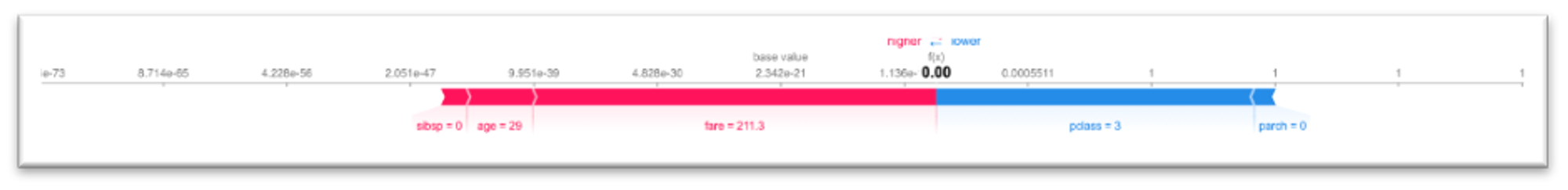
The sum of SHAP values represents the difference between the model response for the analyzed case and the average model response. The last one is resulted as "base value". For instance, we are solving the "Titanic Survival" problem and got the following results:
The first example relates to the positive response of the model - we got the probability 1.0, while the negative answer characterizes the second one. SHAP values allow us to understand why the model provides so different reactions while the values of the features are mostly equal.
We may see that the age, sibsp and fare features positively impact the model response in both cases. Still, pclass has a powerfully positive impact in the first example and strongly negative in the second one. At the same time, the positive effect of the age and fare features decreases that enforce the negative impact of pclass.
The difference between the model responses (log-odds) and the base log-odds value is equal to 170.35 and 26.93 correspondingly. As the base value is -47.93, the estimated log-odds for these examples are 122,42 and -21,0, so the probability of survival for the first case is equal to , while for the second example we get .
Summary Plot
The Summary Plot represents the combination of the features' importance and the features' impact on the model's output. The explanation of each observation's model response is described as a single dot, in which x position corresponds to the SHAP value of that feature. The feature's value (from low to high) is reflected via the color of the dot (from blue to red).
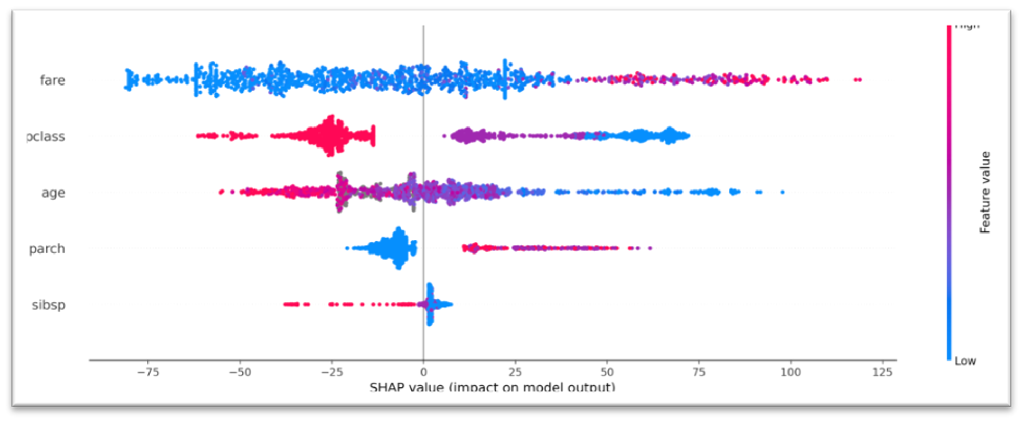
Let's consider the pclass, which takes three values - 1, 2, and 3, and according to the training data, the passengers traveling in the first-class had more chances to survive. The Summary Plot reflects this dependency - we can see that low values of pclass feature (e.g. 1st class) mostly have a positive value to the model response (characterized with big positive SHAP values), while the high values of pclass (e.g. 3rd class) correspond to the big negative SHAP values and have a negative impact.
Dependency Plot
The dependency plot shows the effect of a single feature on the model's prognosis. Each dot is related to the single prediction - x-position is determined by feature value, and y - the corresponding SHAP value. The color of dots depends on the feature value.
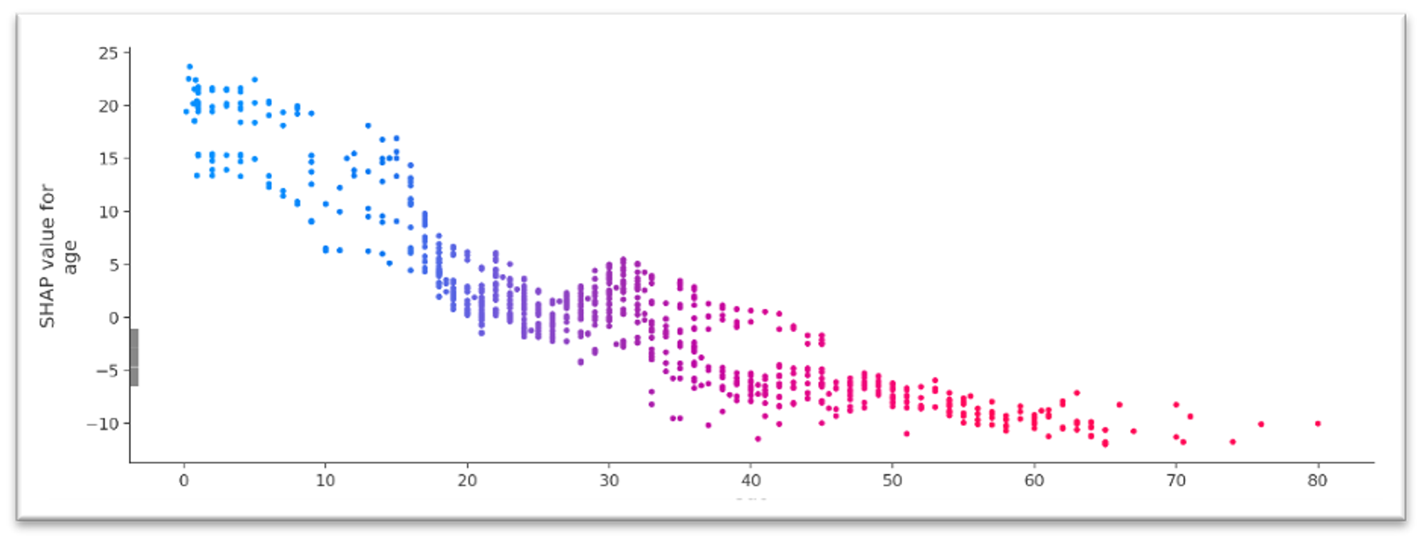
For instance, the age feature shows the negative correlation between its values and the SHAP values - the older passenger the stronger the negative impact of the age on the model response.
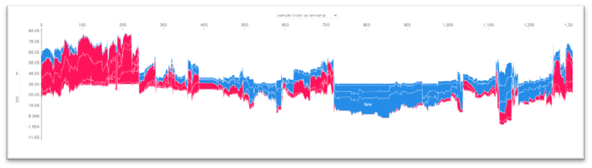
Force Plot
Force plot - is the visualization of the features attributes that force to increase or decrease the prediction. The prediction starts from the base value - the average of all model responses. Each Shapley value is depicted as an arrow that makes the model increase or decrease the prediction.
A multi-prediction force plot combines many individual force plots that are rotated 90 degrees and stacked horizontally. This prediction can be ordered by observations number or similarity and by the values of the particular features. This chart provides the complete vision of the impact of different factors on the predictions regarding the individual observations combinations.
Model Explain Dashboard
The Datrics platform provides the possibility to get a detailed explanation of the responses provided by any machine-learning model that is aimed to solve the either classification or regression problem via the Model Explain dashboard.
Model Explain dashboard contains three tabs:
- General charts - contains the charts that provide the general picture of the impact of the features on the model response:
- Summary plot - see Summary Plot section.
- Dependence plot - see Dependency Plot section.
- Multi-prediction Force plot - see Force Plot section
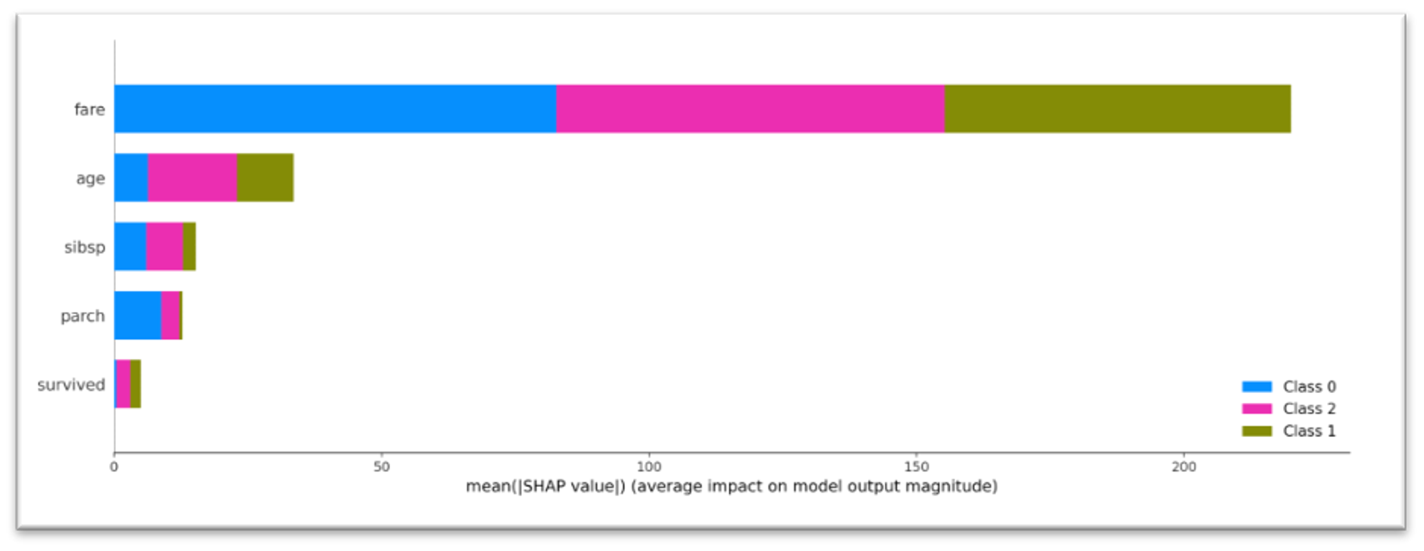
The view of the Summary Plot depends on the target variable. For the case of binary or float target variable (e.g. we are solving the binary classification or regression problem), Summary Plot reflects the features' impact on the model's output as a dot-plot. For the multiclass classification, the features' impact is represented as SHAP feature importance the average of the absolute Shapley values per feature across the data per each class:
Dependence plot represents the general impact of the specific feature on the model response - feature is selected via the drop-down menu
For the case of multiclass classification, the Multi-prediction Force plot chart is built for each class that can be selected via the drop-down menu.
- Per observation analysis. Tab provides an explanation of 10 individual predictions via "force plot" - the visualization of the features attributes that force to increase or decrease the prediction. For the multi-class classification, the Force Plot is available for each class. Observations are either randomly selected from the input dataset or taken from the optional data input.
- What-If. Tab explains the individual model response via a Force Plot chart. For the multi-class classification, the "force plot" is available for each class. The features for the particular case can either be manually defined or randomly selected from the input dataset.
The Model Explain Dashboard is available in Explain Model brick.
Explain Model Brick
Brick Location
Bricks → Machine Learning → Explain Model
Brick Inputs/Outputs
- Inputs
- data - mandatory dataset that is used for the creating the general plots
- model - trained classification/regression model
- data sample - optional dataset that is the datasource for the per-observation analysis
Outcomes
- Model Explain Dashboard. Users have a possibility to not only get the explanation of the prediction results but integrate the model explainer into the model so that they have a possibility to get an explanation per each model response via an API request.
Example of Usage
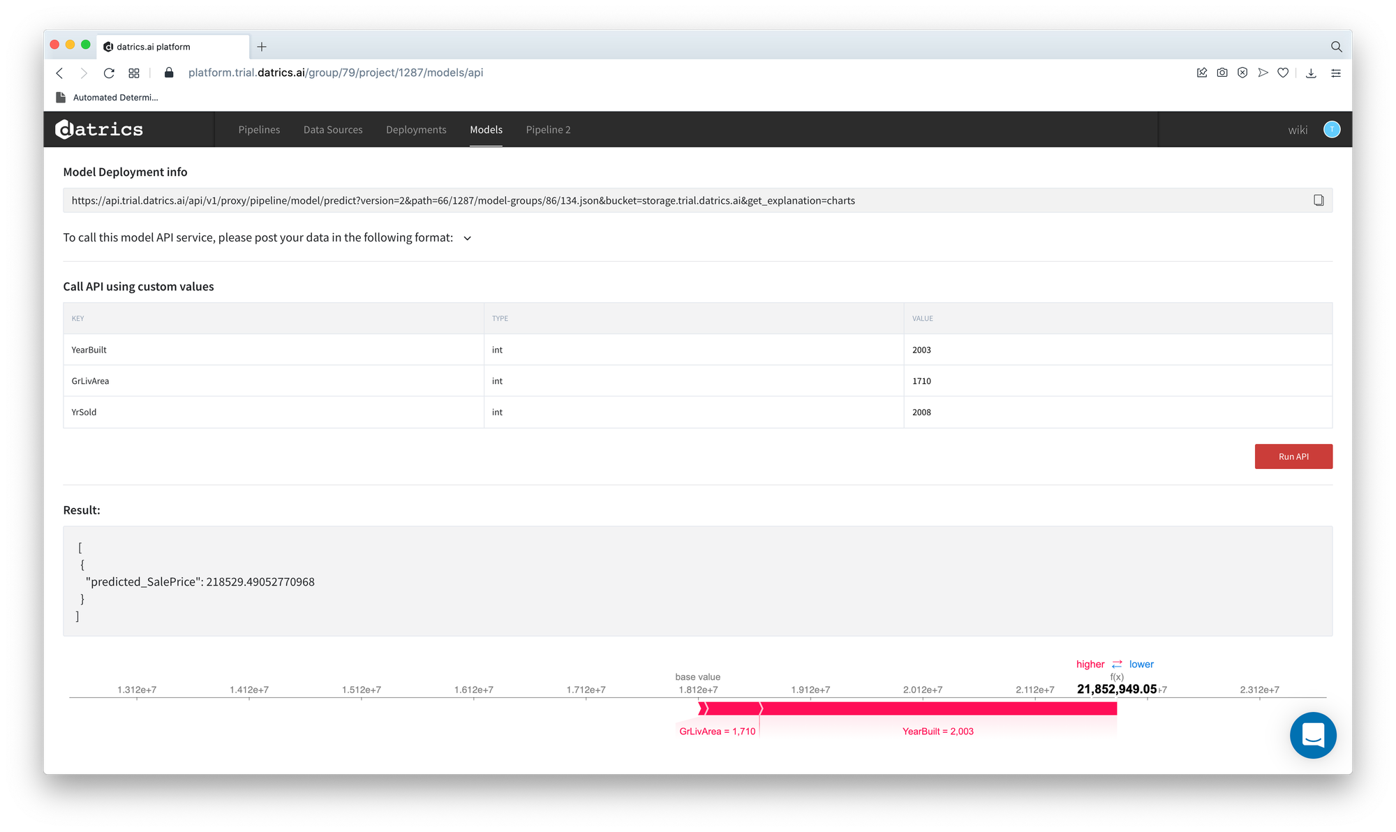
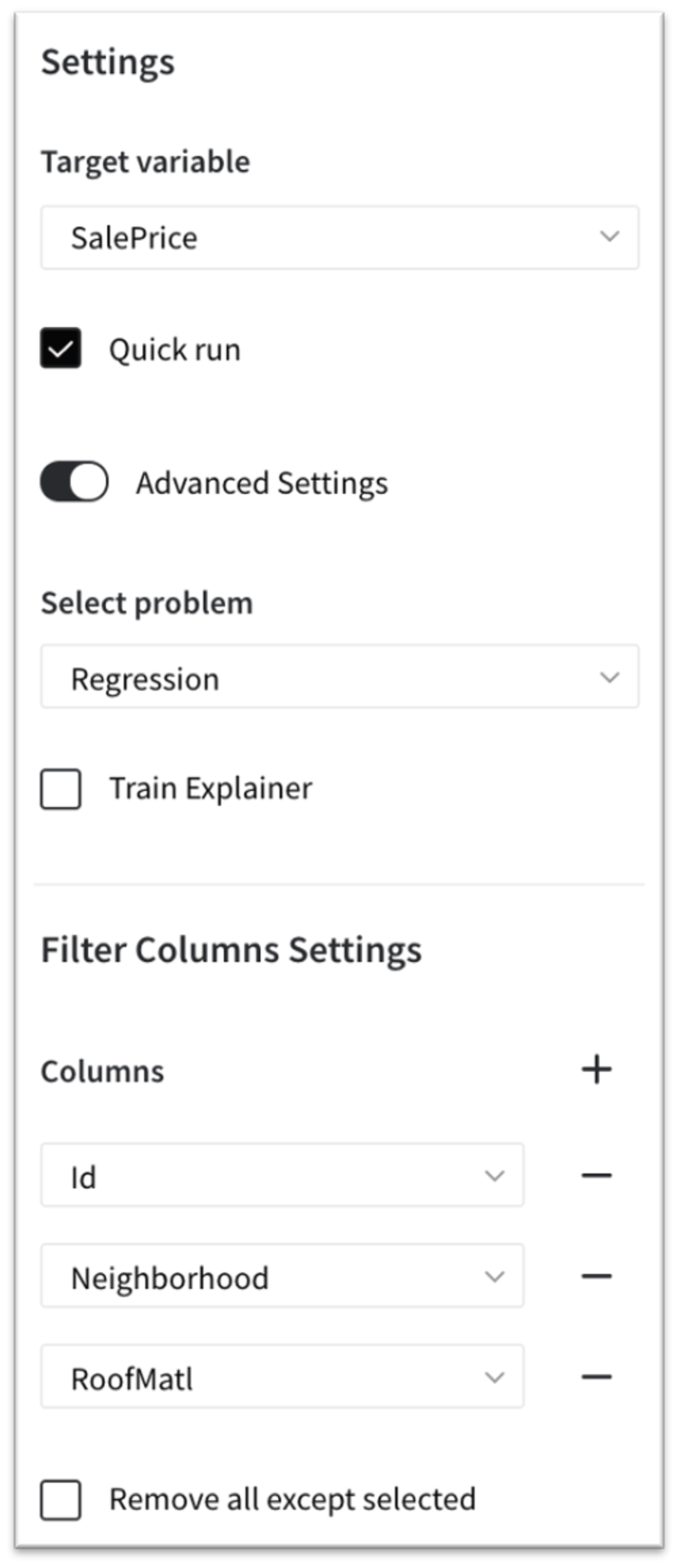
Let's create the simple House Price Prediction model. The "home_price_sample.csv" dataset is passed to the AutoML Predictive Model brick, which is configured as:
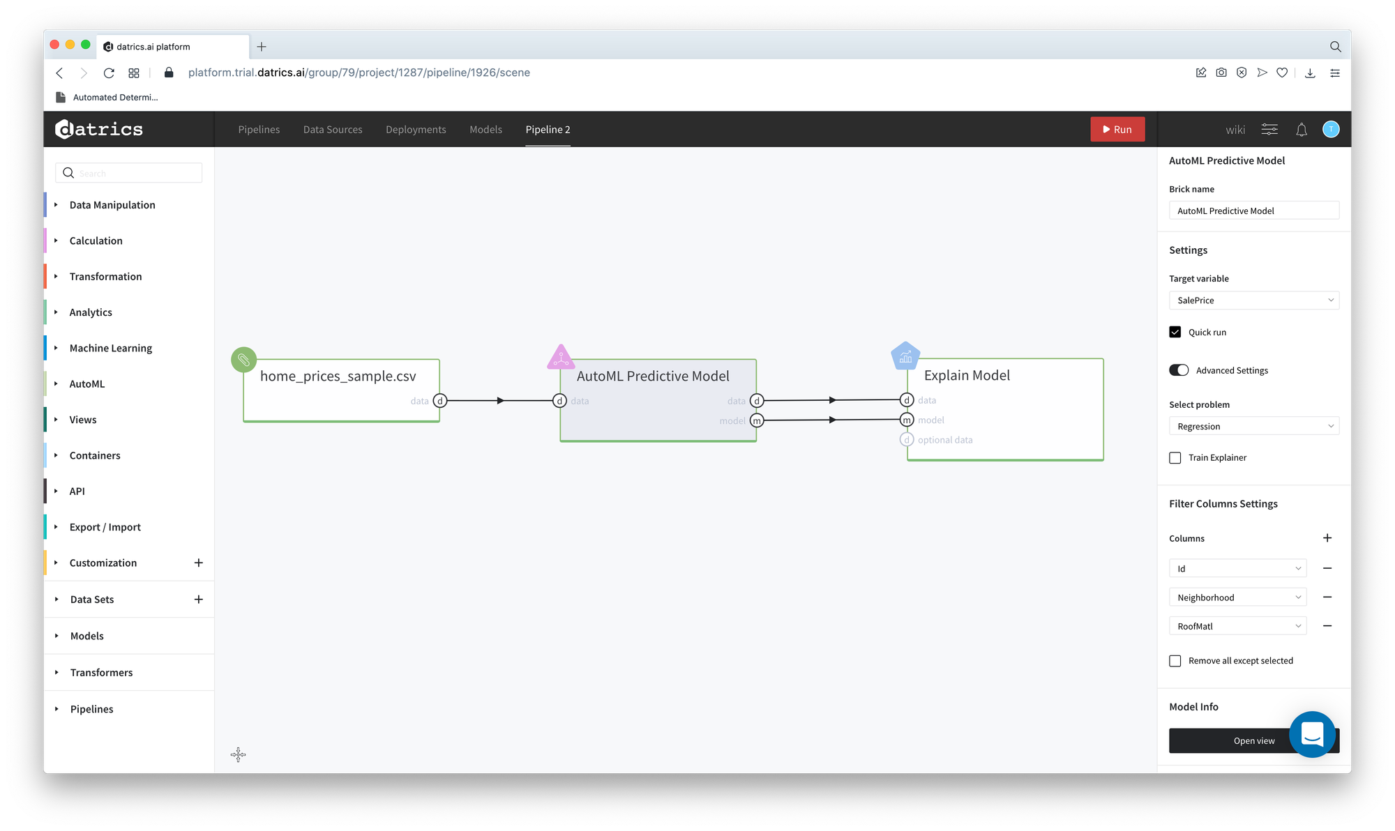
The trained model passes to the Explain Model brick. After the pipeline running you can open the Explain Model Dashboard.
General Charts
Summary Plot
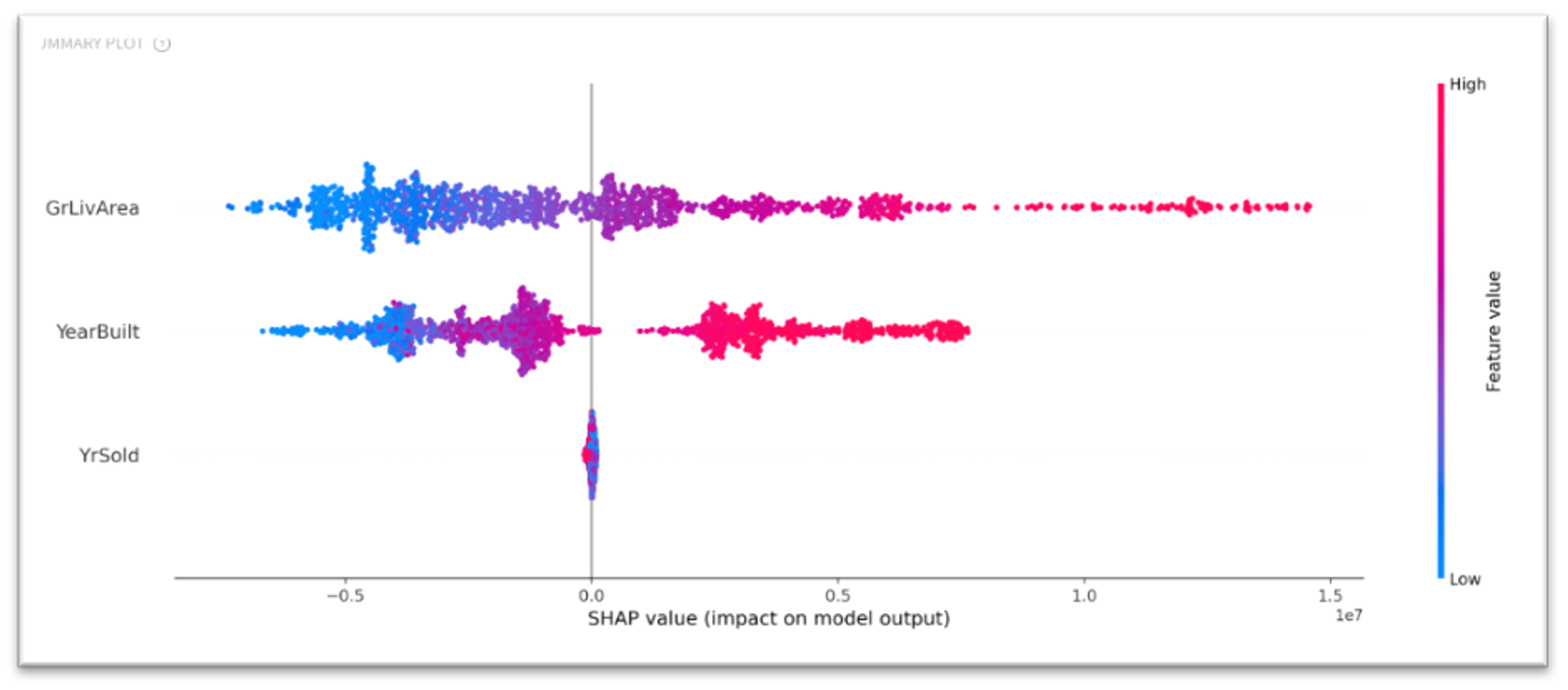
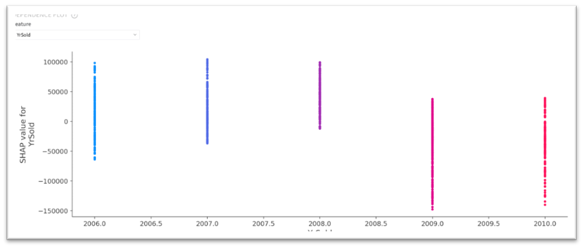
According to the Summary Plot, the YrSold feature has almost no effect on the model response, while the other two features have the recognized impact - there is a positive correlation between feature values and the SHAP values.
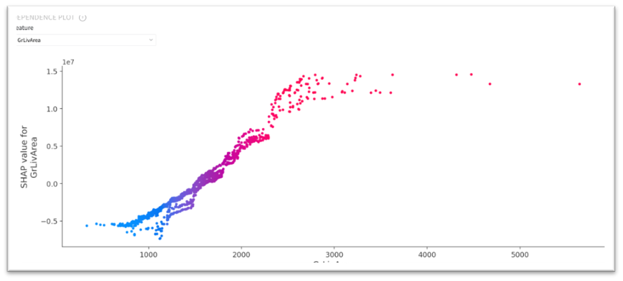
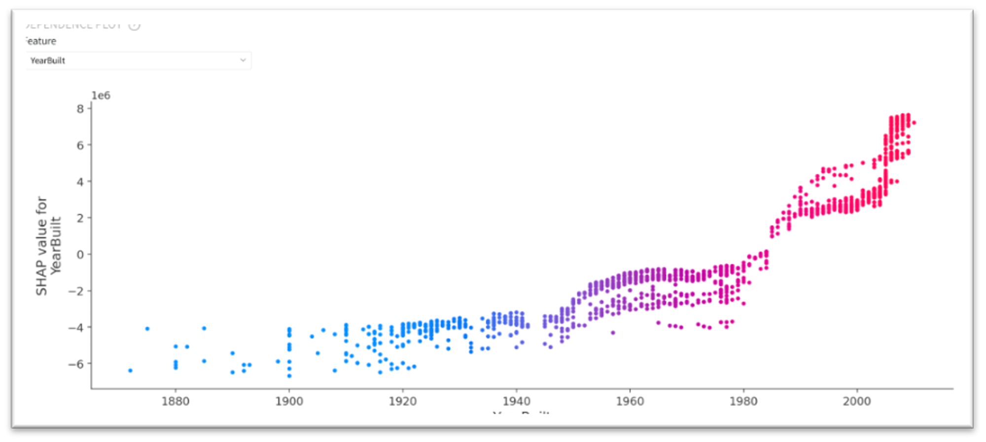
Dependence Plot
The dependencies mentioned above are reflected in the Dependence Plot. As we can see, for the GrLivArea this dependence is almost linear, while for YearBuild it is rather polynomial.
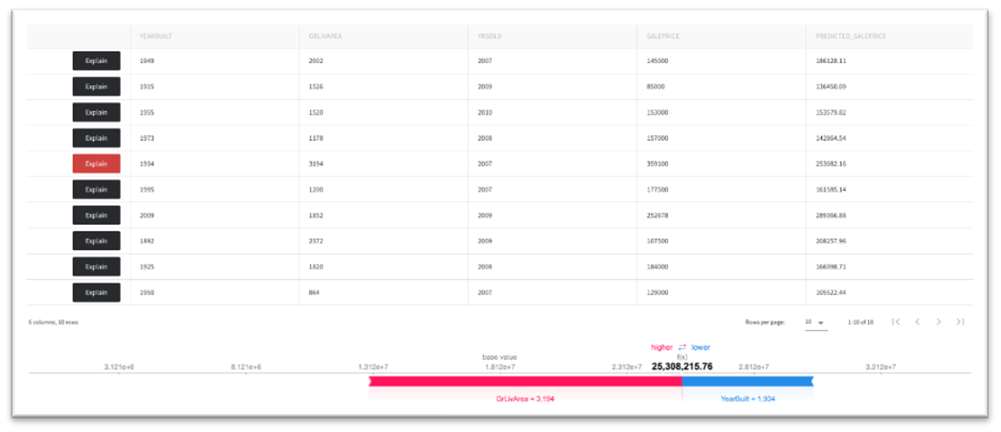
Per Observation Analysis
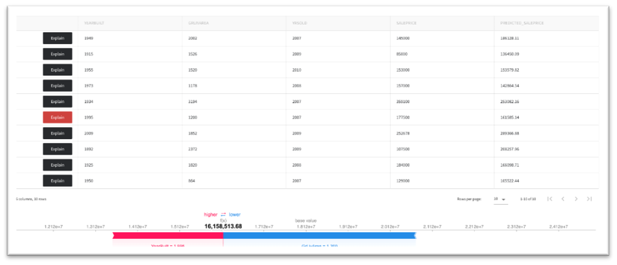
The "Per observation analysis" tab demonstrates the detailed explanation of the specific model response. On the figure to the left, we can see that the predicted house price is equal to $253082, and the positive driver is the house live area, while the year of the building (1934) has a negative impact. The figure on the right demonstrates the opposite situation when the positive driver of the house's price is year of the building (1995).
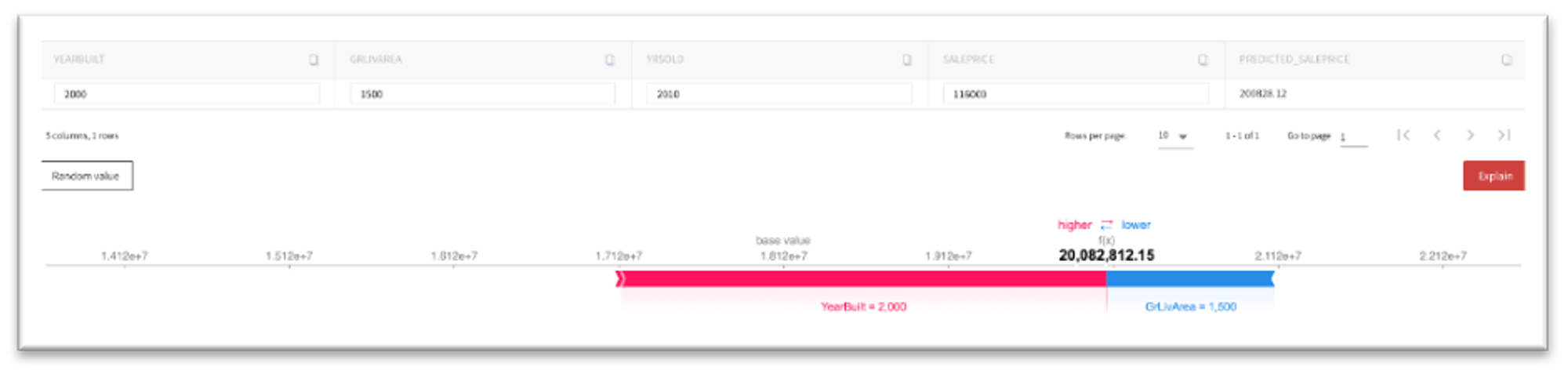
What-If analysis
You may try to manually set the house characteristics and get the estimated house price with the explanation of the reasons of the specific answer.
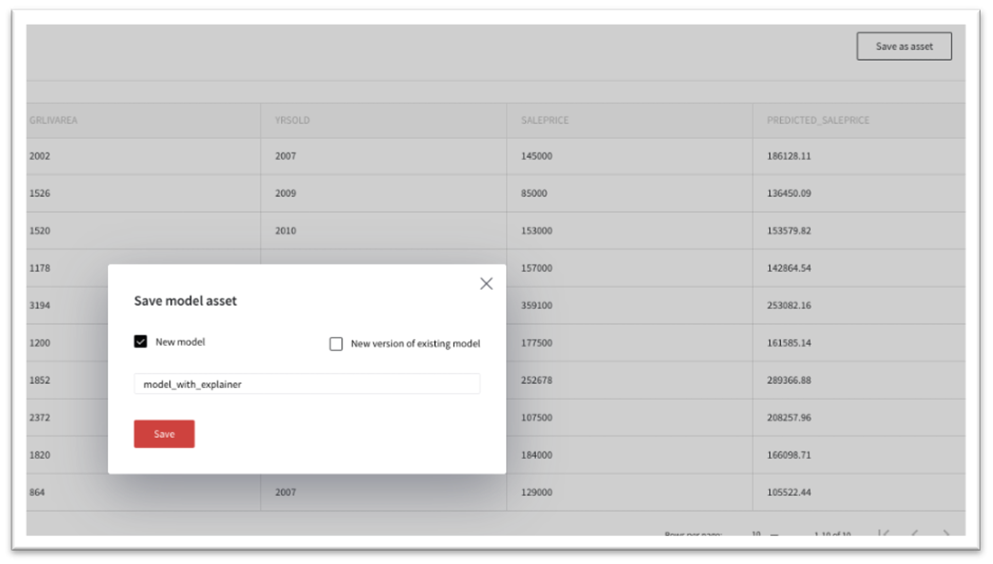
Save Model with explainer
You may integrate the model explainer into the model and save it as an asset for further usage.
Press "Save as Asset" and type the name of the model. The model will be saved and available in the Models dashboard.
After that, the model can be triggered via API request and the model response will be accompanied by the explanation chart or SHAP values: