General information
Brick provide wide possibility of data visualization with different dashboards, they are:
- bar plot for tracking changes over time or comparing different groups
- box plot for showing distributions, identifying outliers or finding differences between categories
- scatter plot for showing relationship between two variables and exploring patterns of this relationship
- heatmap plot for visualizing concentration of values in two dimensions
- histogram plot for showing distributions
- line plot to visualize changes over time or to display data over numerical axis
- pie chart to show parts of the whole
- treemap for organizing hierarchical data
- Gantt chart for planning and scheduling processes, based on time and resources needed
- radar chart (the same as spider chart) to visualize multidimensional data
Description
Brick Locations
Bricks → Views → Charts
Brick Parameters
- Plotting speed optimization
Choose this option if you want to build your plots more fast but will lose a bit in resolution.
- Add a chart
- Diagram Type
- Chart Name
- X column
- Y column
- Group by
- Aggregation
- Сolumns
- Group column
- Show outliers
- Display as a violin
- X column
- Y column
- Size
- Color
- Opacity
- Linear approximation
- X column
- Y column
- Aggregation
- Columns
- Show Distribution
- Show rug
- X column
- Y column
- Group by
- Show data points
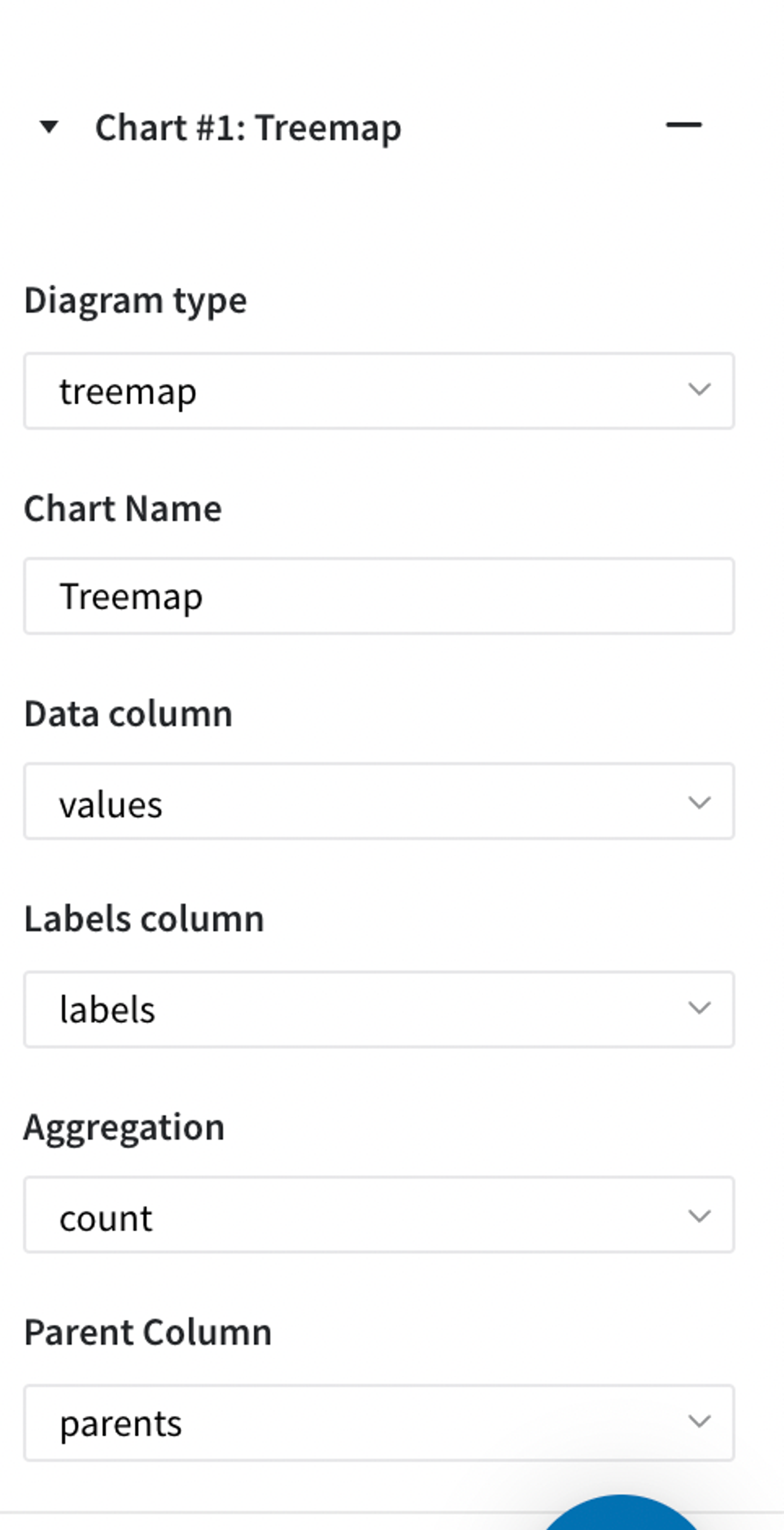
- Columns Hierarchy
- Data Column
- Labels Column
- Aggregation
- Parent Column
- Date Column
- Event Column
- Color Column
- Categories Column
- Names Column
To add a new
Specify type of dashboard to plot on. There are: bar, box, scatter, heatmap, histogram, line, pie, treemap, gantt, radar.
A name for the chart
Then, for different type of charts there are different parameters that are needed to be filled.
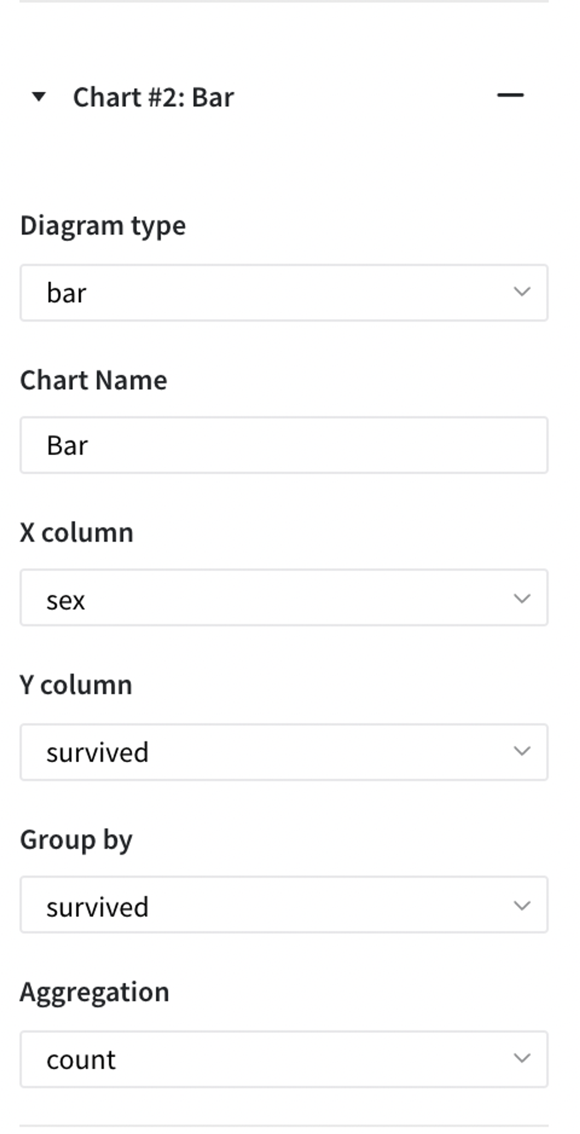
bar
The column that would be on the x (horizontal) axis
The column that would be on the y (vertical) axis
The column by which divide the bars
Different type of aggregation: count, mean, max, min, sum, median, mode.
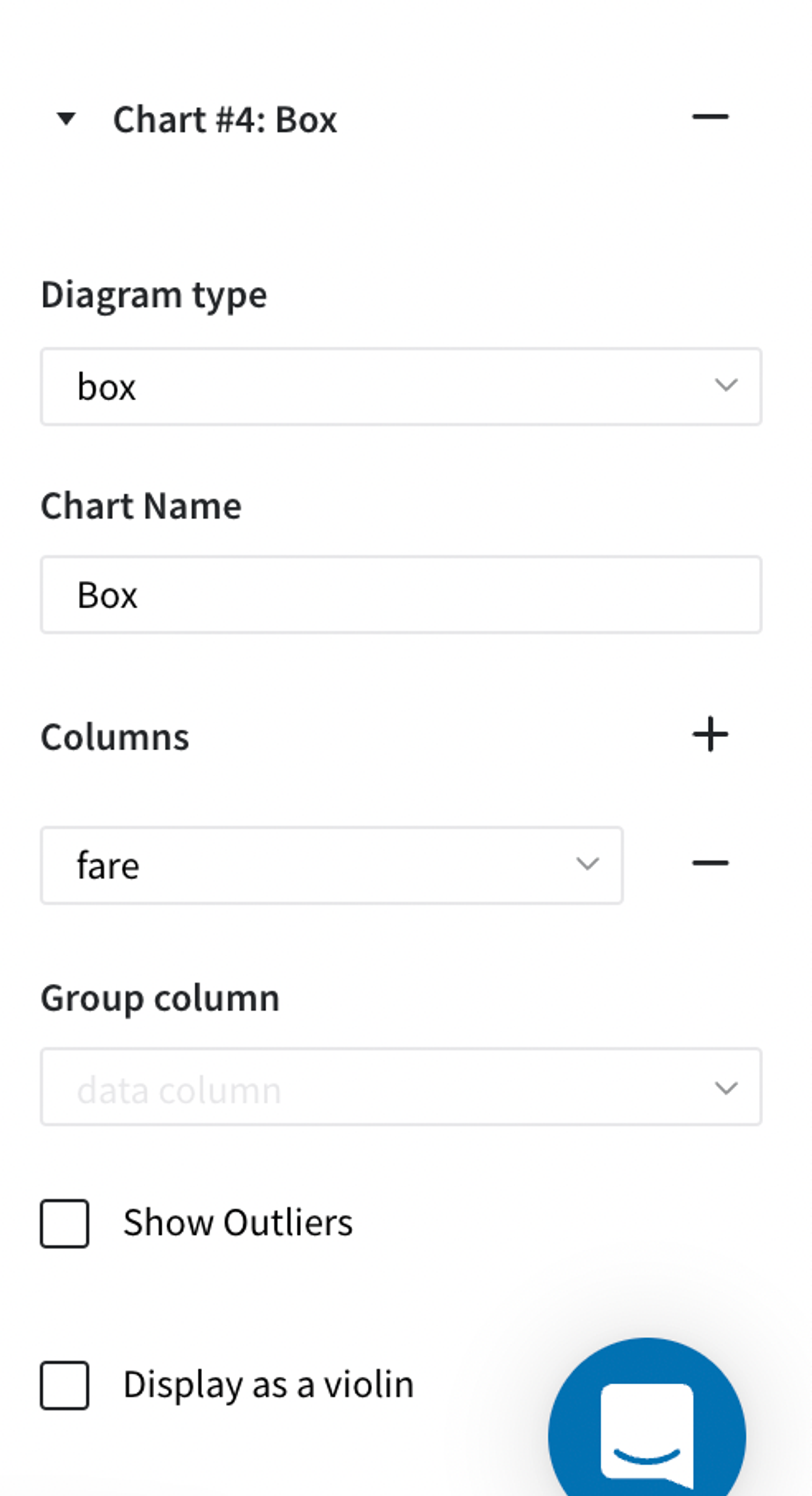
box
The column which would be represented on the plot
The column by which the values would be grouped
Turn parameter on to show dots which are out of IQR
Turn parameter on to show it in the violin form
scatter
The column that would be on the x (horizontal) axis
The column that would be on the y (vertical) axis
Can be chosen for either value or column
Can be chosen for either value or column
The level of opacity varies from 0.1 to 1
Turn parameter on to show the line trend
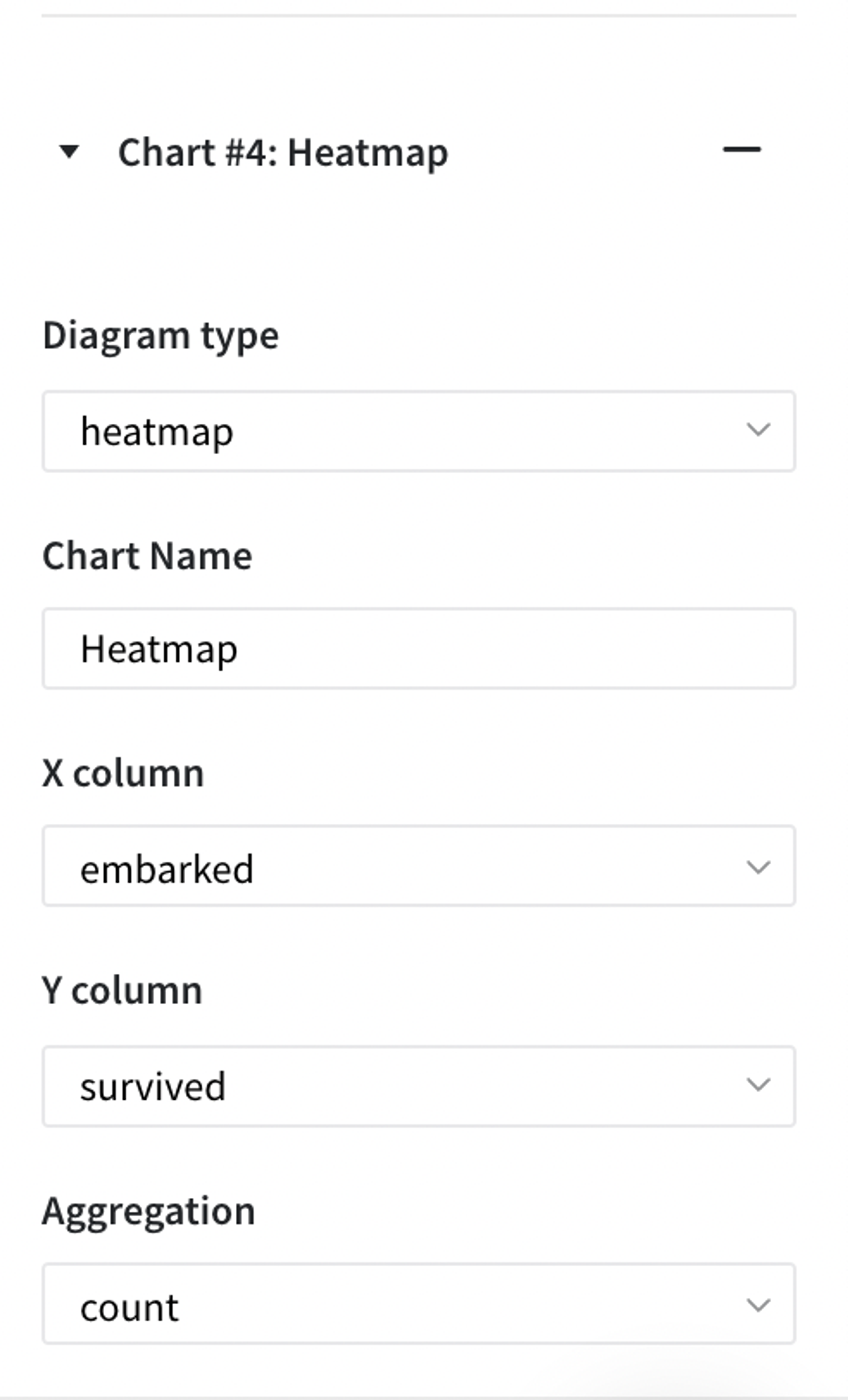
heatmap
The column that would be on the x (horizontal) axis
The column that would be on the y (vertical) axis
Different type of aggregation: count, mean, max, min, sum, median, mode.
histogram
Columns for plotting dashboards
Turn parameter on to show distribution of selected data
Turn parameter on to show rug
line
The column that would be on the x (horizontal) axis
The column that would be on the y (vertical) axis
The column by which divide the bars
Turn on to show points as well as line
pie
You can insert pie chart inside of another chart and you can order them in any way
treemap
Column which contains values
Column which maps label to a data
Different type of aggregation: count, mean, max, min, sum, median, mode.
Column which maps the parent to a label
Gantt
Column with a date values in it
Column which contains names of events
Column with colours for each event
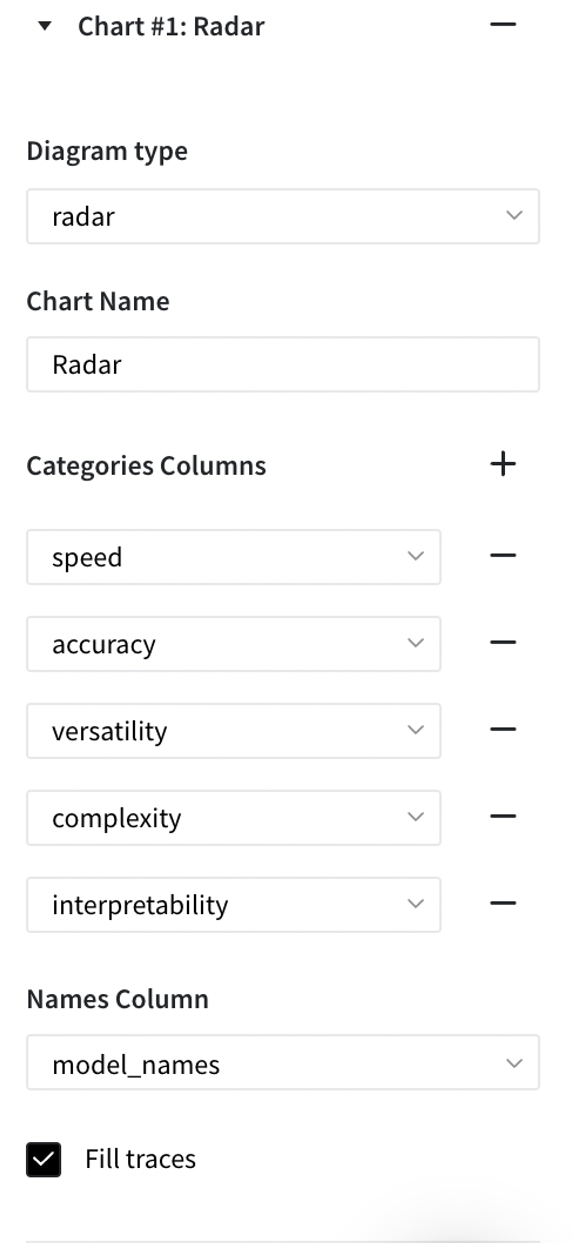
radar
Column that consists ranking in different categories
Column that consists names of the items
- Open dashboard view
Shows all the plots that have been built. In this view it is possible to download a png file, zoom a plot, autoscale or reset axes.
Brick Inputs/Outputs
- Inputs
Brick takes the data to plot
Example of usage
Let's consider the binary classification problem. The inverse target variable takes two values - survived (0) - good or non-event case / not-survived (1) - bad or event case. The general information about predictors is represented below:
- passengerid (category) - ID of passenger
- name (category) - Passenger's name
- pclass (category) - Ticket class
- sex (category) - Gender
- age (numeric) - Age in years
- sibsp (numeric) - Number of siblings / spouses aboard the Titanic
- parch (category) - Number of parents / children aboard the Titanic
- ticket (category) - Ticket number
- fare (numeric) - Passenger fare
- cabin (category) - Cabin number
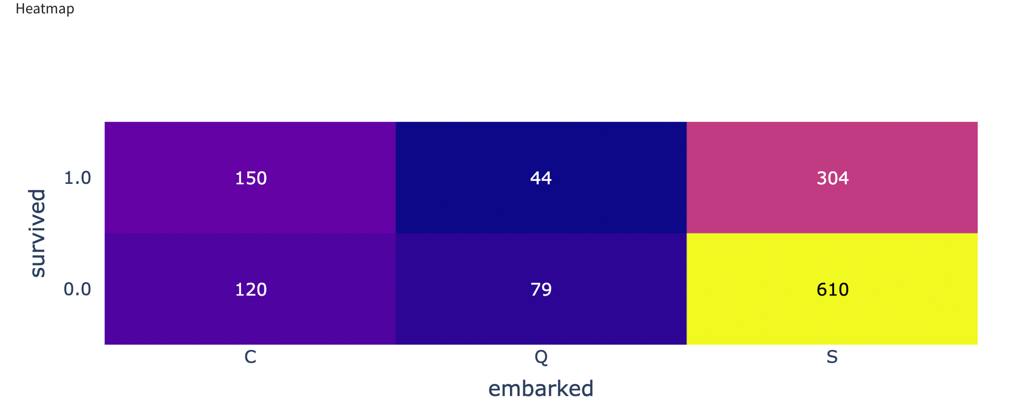
- embarked (category) - Port of Embarkation
Let’s move to some visualizations.
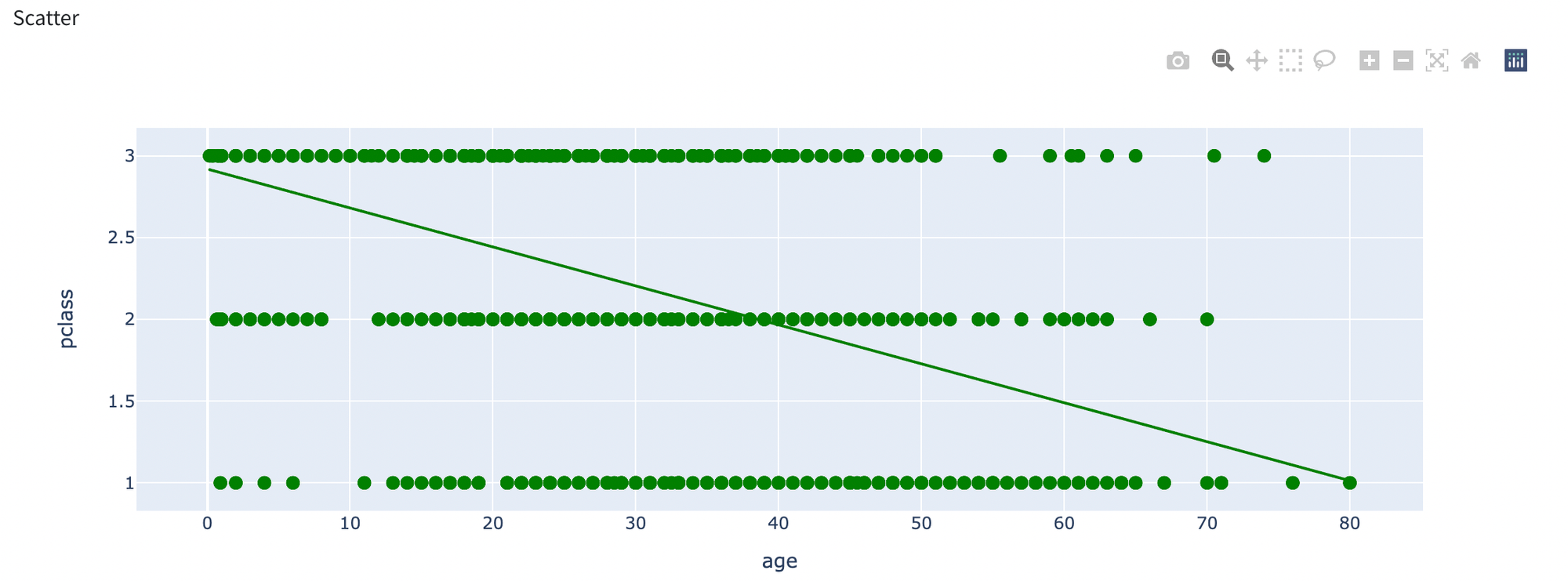
- First one will be scatter plot with settings listed below with result:
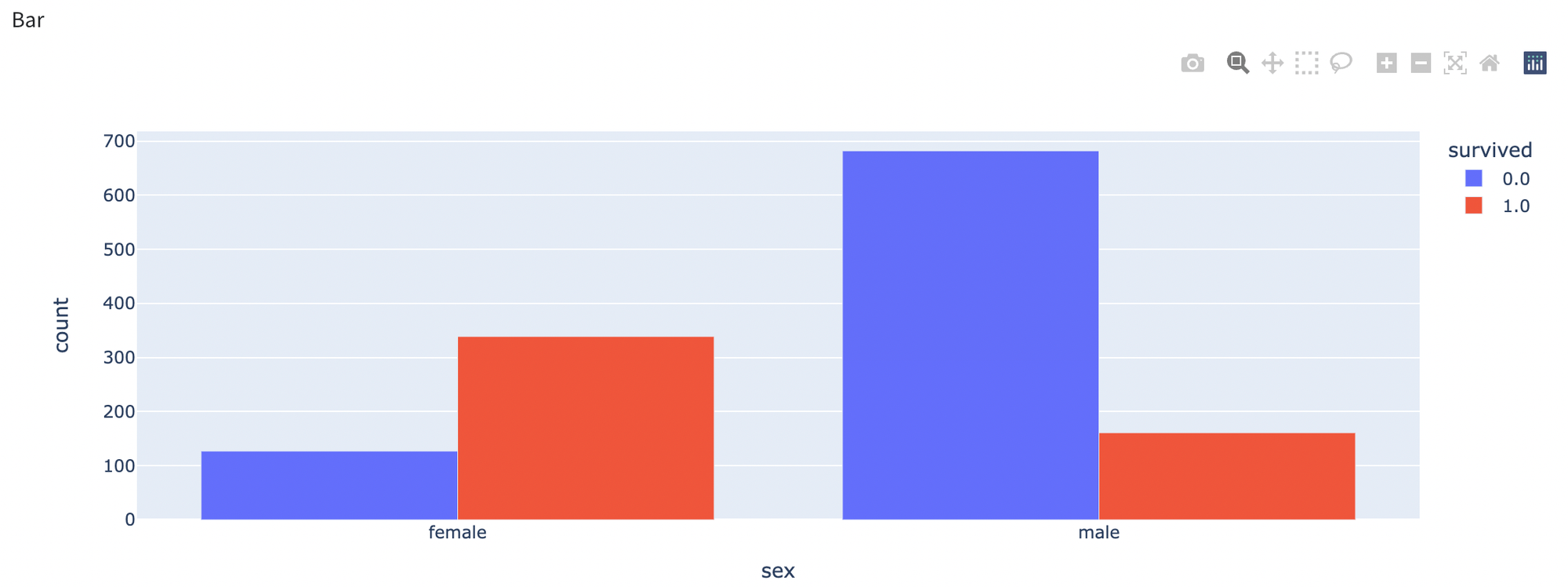
- We will show a bar chart where on x axis we put sex column and for y axis survived column.
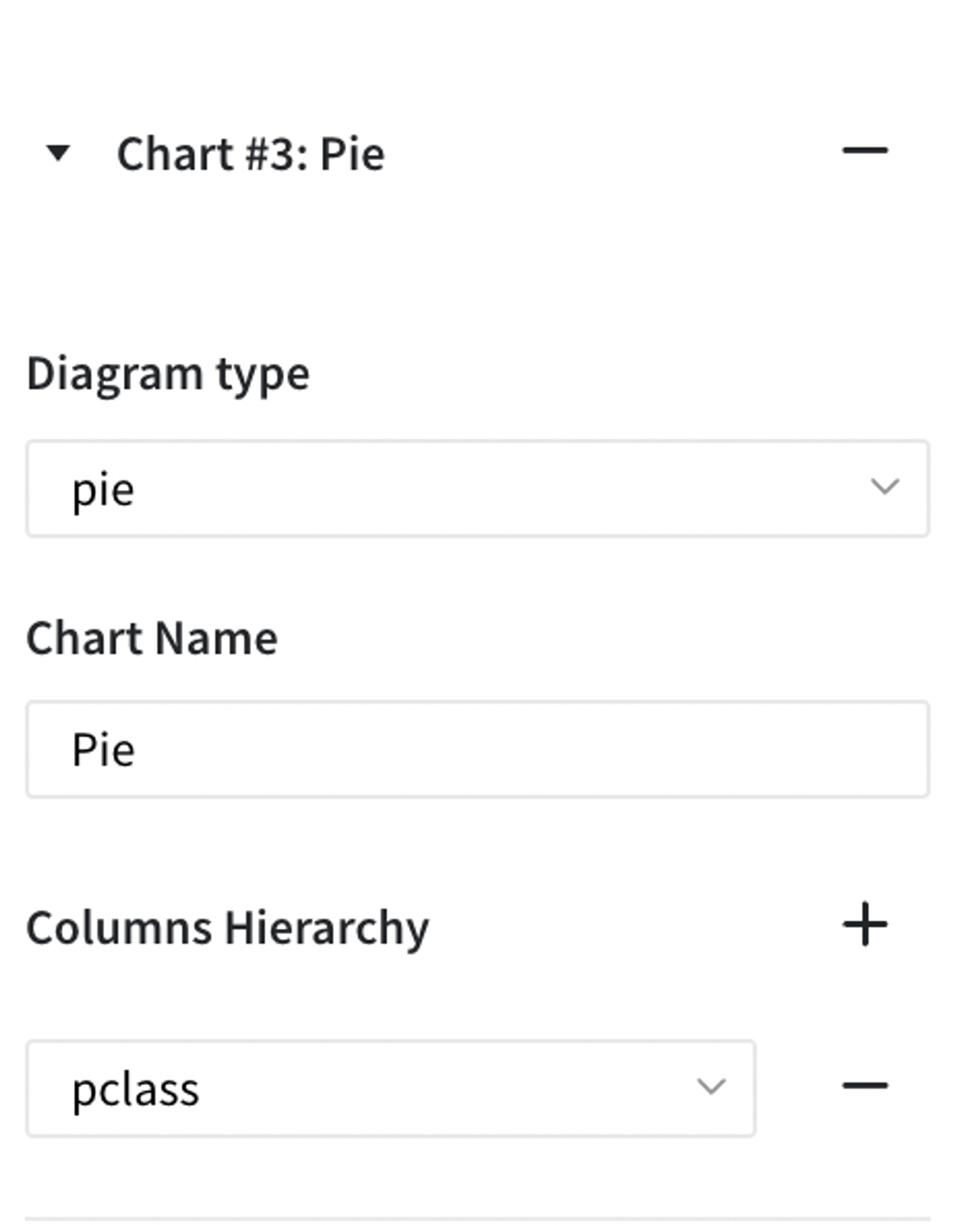
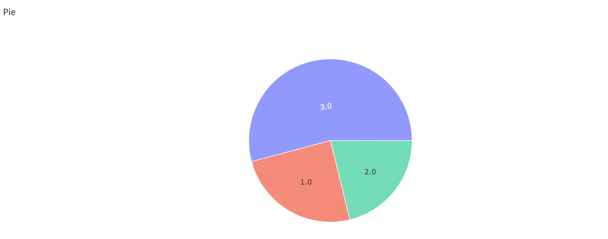
- We build a pie chart for pclass:
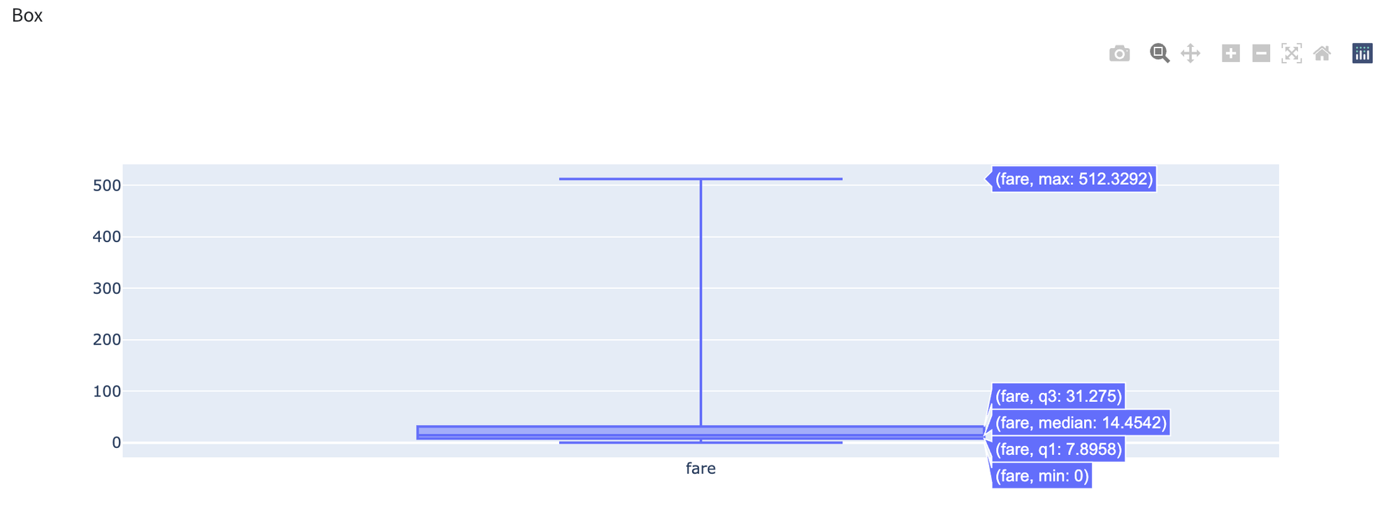
- We will build a box plot for fare column
- We will show how to build a heatmap plot:
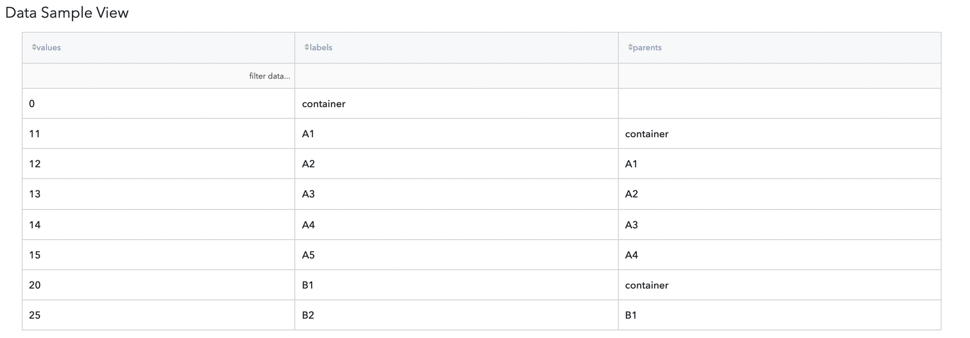
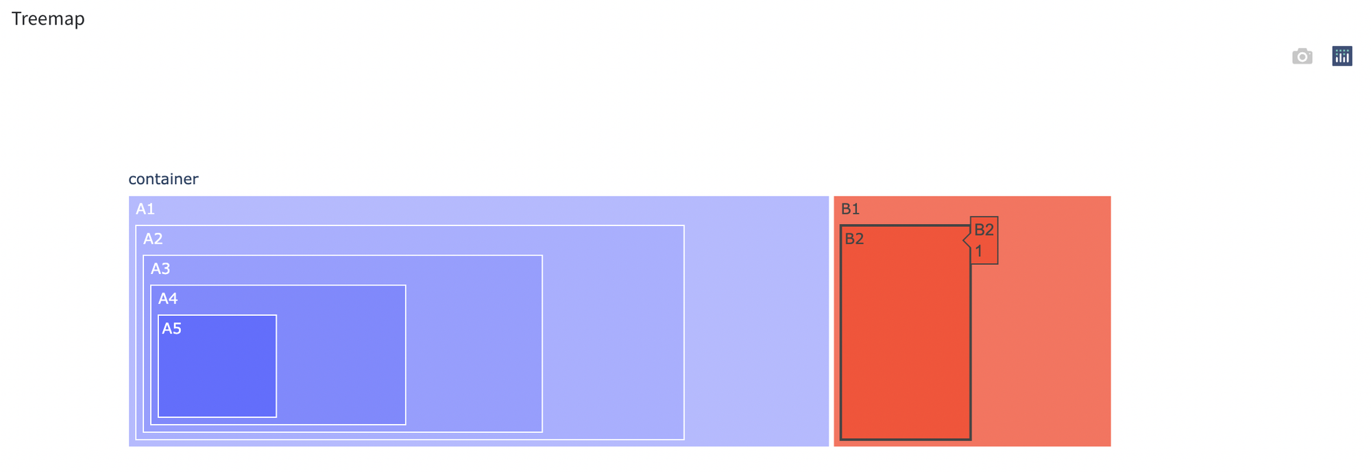
- To plot a Treemap chart we need to create some synthetic data, the data and chart build will be presented below:
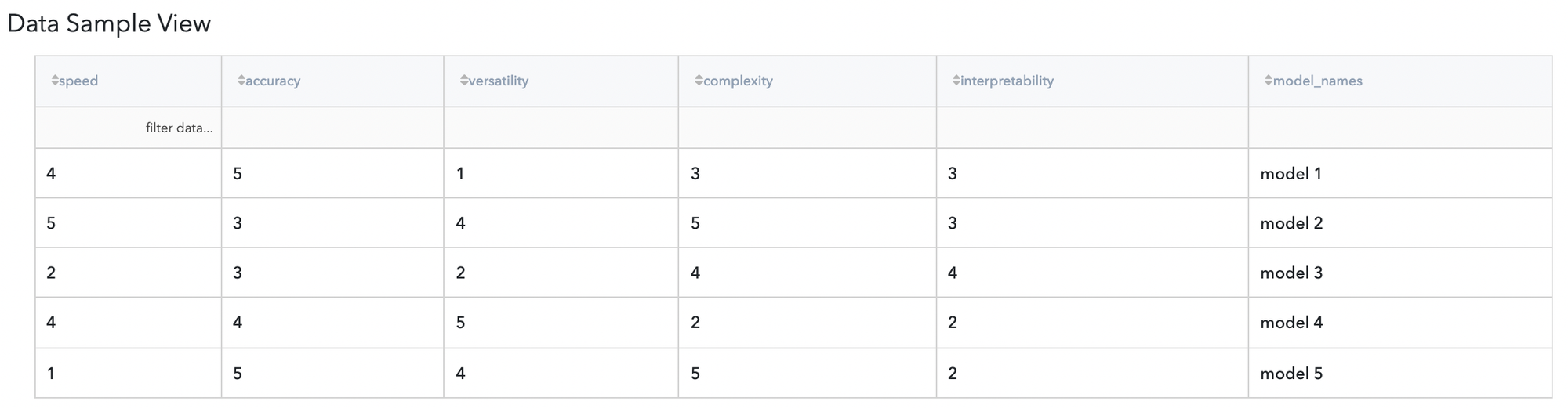
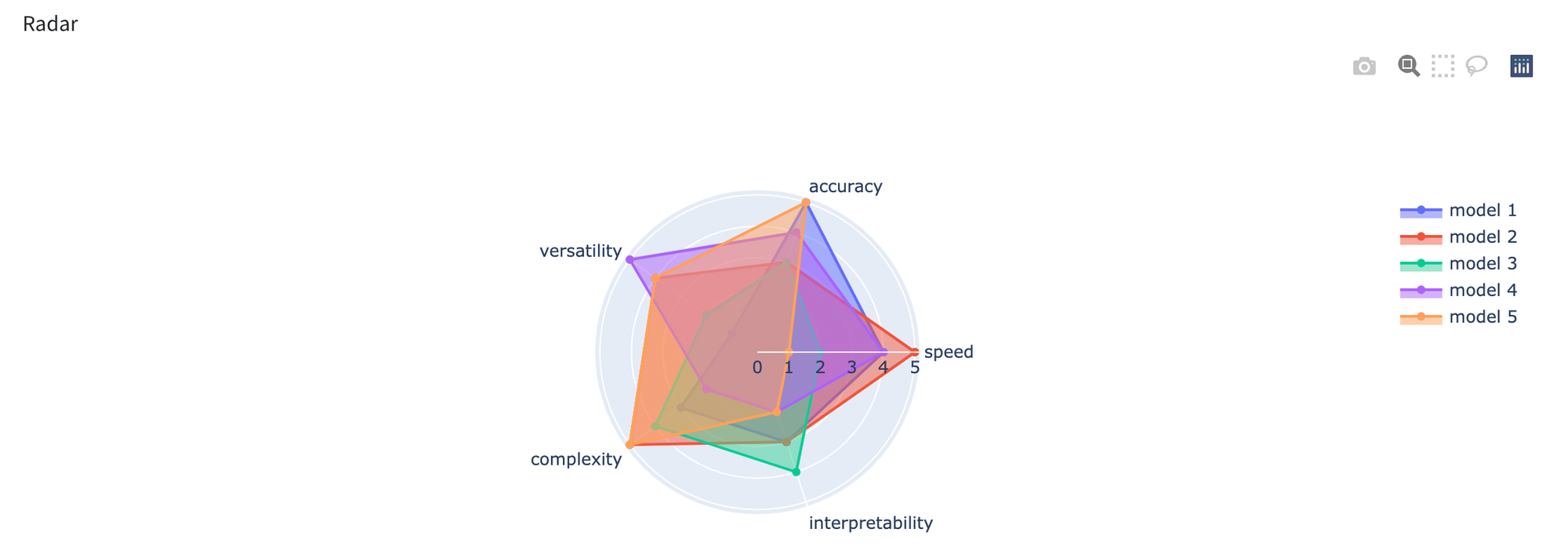
- Next example will be associated with a radar chart, for this example we also need to create some synthetic data. Let’s visualize results we have: