General information
The main purpose of this brick is to visualize the predicted data.
Description
Brick Locations
Bricks → Views → Forecasting Dashboard
Brick Parameters
Brick Inputs/Outputs
- Inputs
Brick takes the dataset
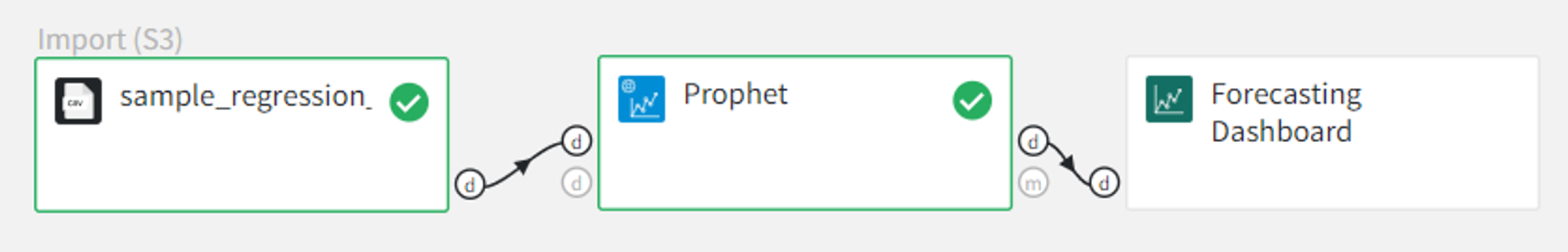
Example of usage
Forecasting Dashboard Brick should be connected to the output of the time series forecasting.
For example, let’s take the ‘sample_regression_time_series_rossmann.csv’ dataset and predict the target variable ‘Sales’ using Prophet forecasting.
To use the Forecasting Dashboard Brick you need to run the pipeline and press the ‘Open dashboard view’ button. All the controls are in the dashboard itself.
Calculated metrics:
- R2 - coefficient of determination
- RMSE - Root Mean Square Error
- MAPE - Mean Absolute Percentage Error
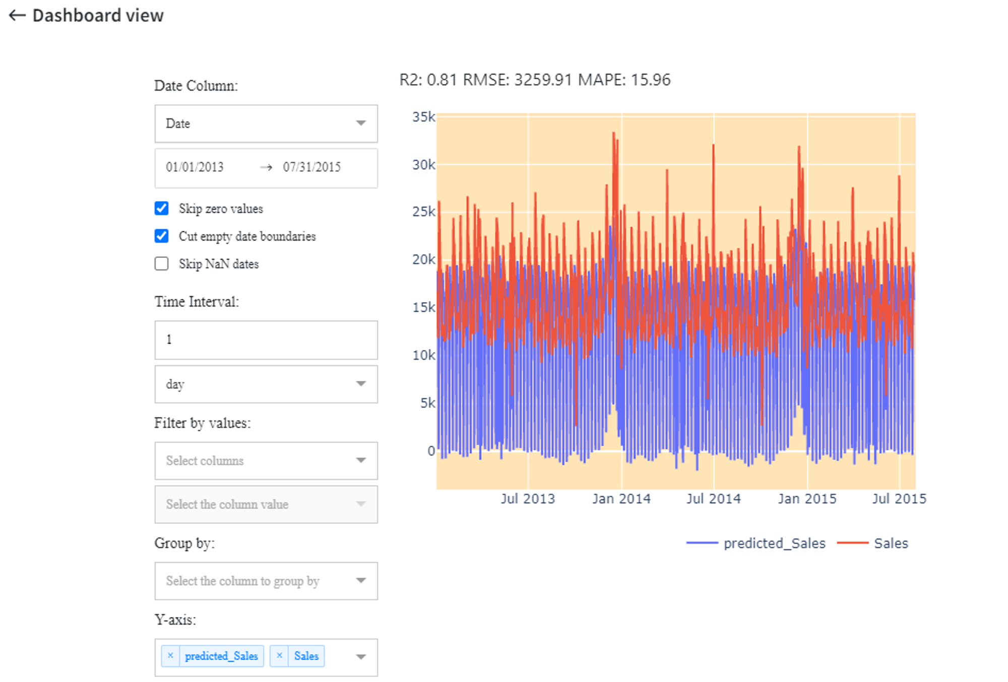
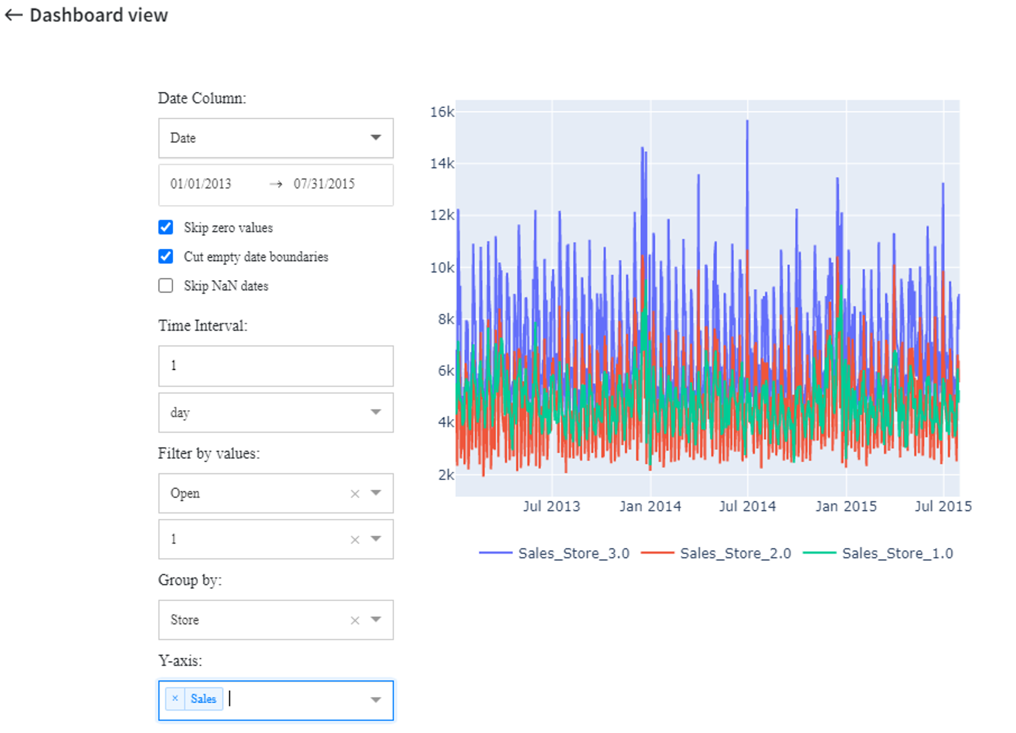
- Date column
‘Date column’ can be selected out of input data columns from the dropdown list.
Below there is a range of dates to visualize. By default, it’s set to the whole date range. It can be modified by clicking on the date and choosing the desired date from the calendar or writing it manually.
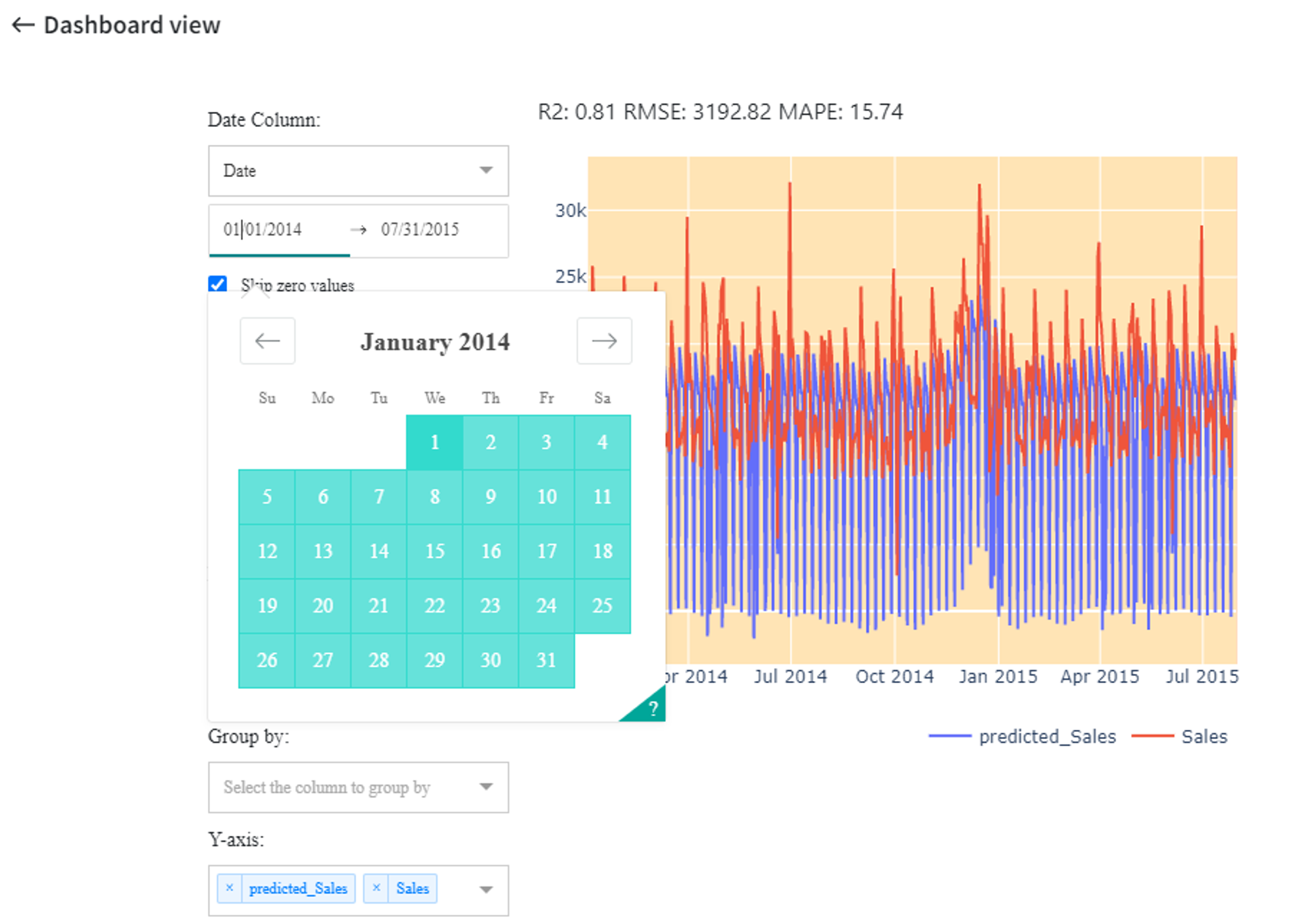
The date range on the graph has been changed so now the dates axis starts from 01/01/2014.
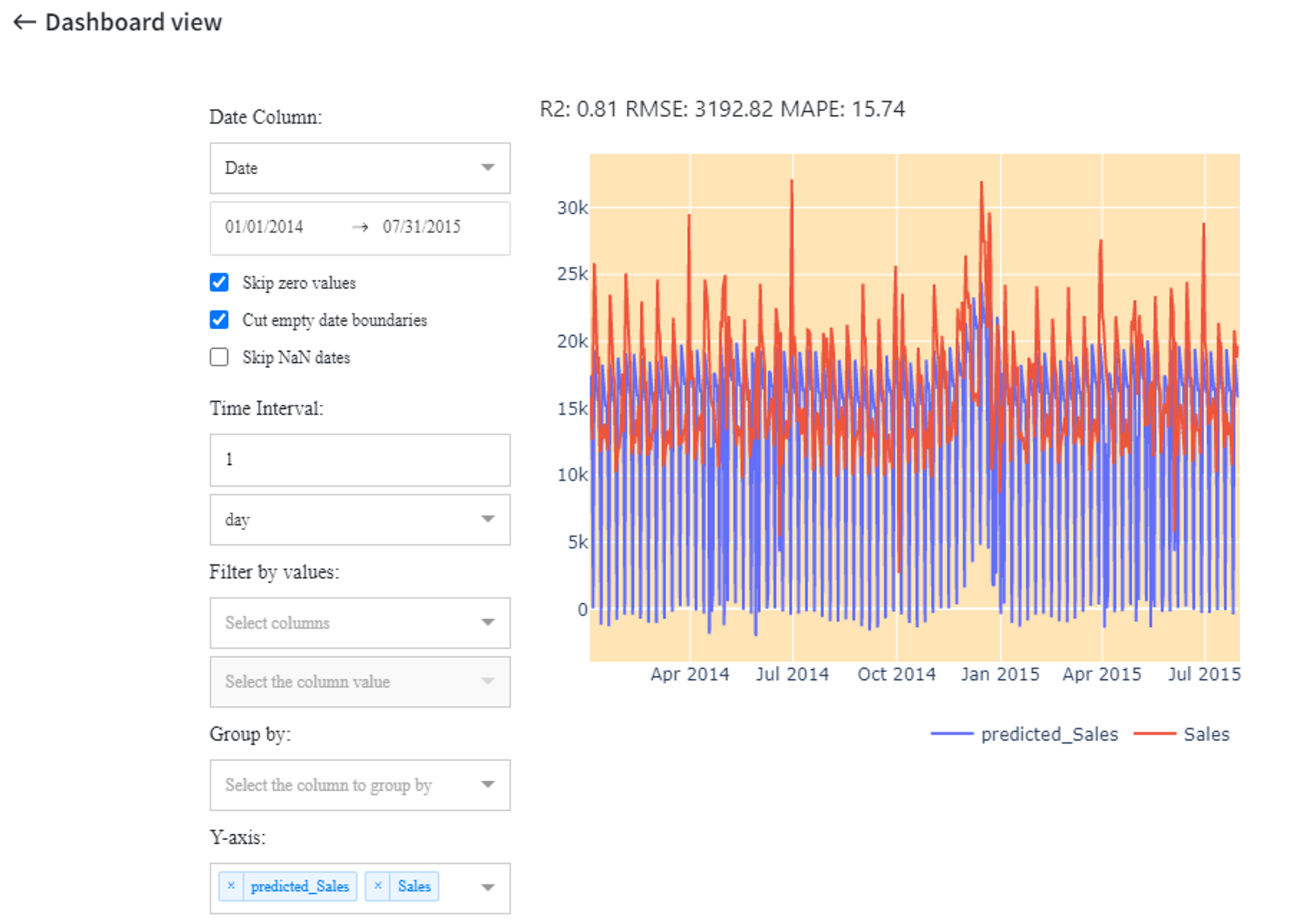
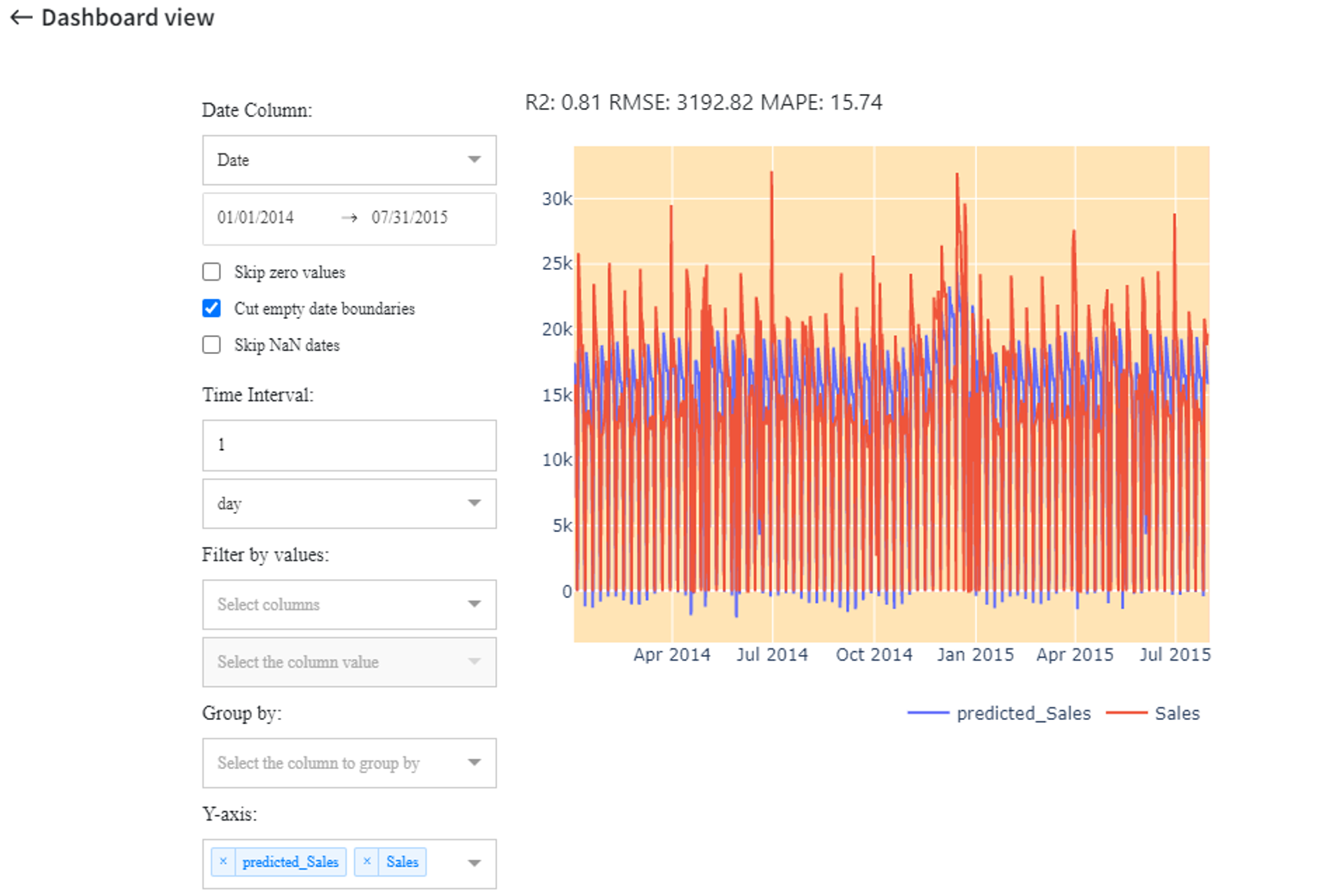
- Skip zero values
‘Skip zero values’ checkbox identifies whether to show the records with the target variable equal to zero. In this case, if unchecked, the samples with ‘Sales’ = 0 are also visualized on the graph.
- Cut empty date boundaries
- Skip NaN dates
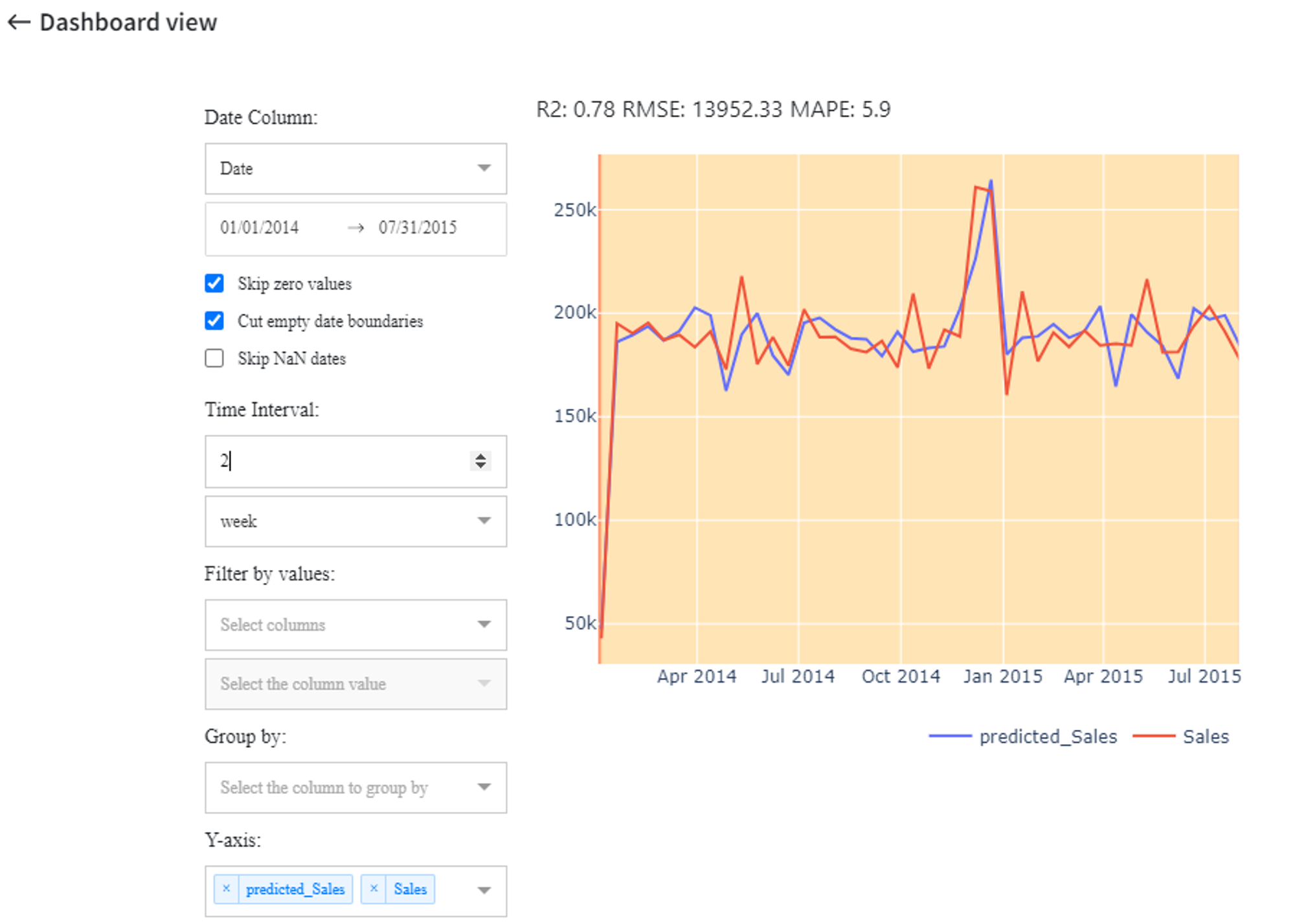
- Time interval
‘Time interval’ setting defines the frequency of data and predictions. You can write any integer number with one of the frequencies from the dropdown list.
Available options:
- hour
- day
- week
- month
- year
For instance, we can choose ‘2 weeks’ and get the following plot with recalculated metrics:
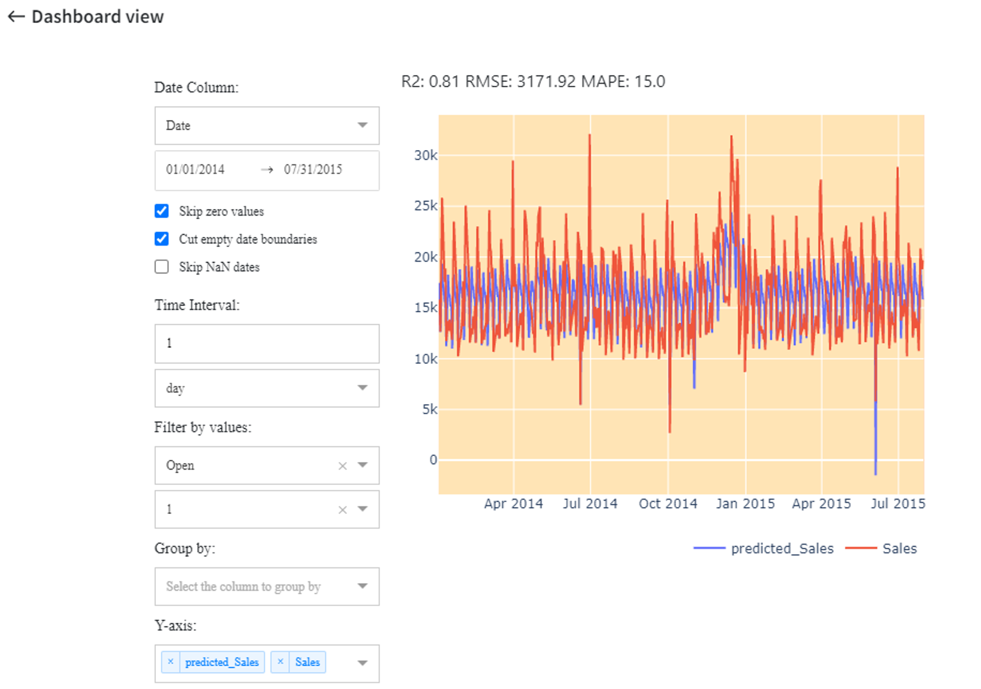
- Filter by values
‘Filter by values’ setting enables the extraction of samples with a specific value for a certain column.
We can get the forecast only for the dates when the store was open by setting ‘Open’ = 1.
- Group by
In addition, it is possible to see the results, grouped by the column values with the ‘Group by’ setting.
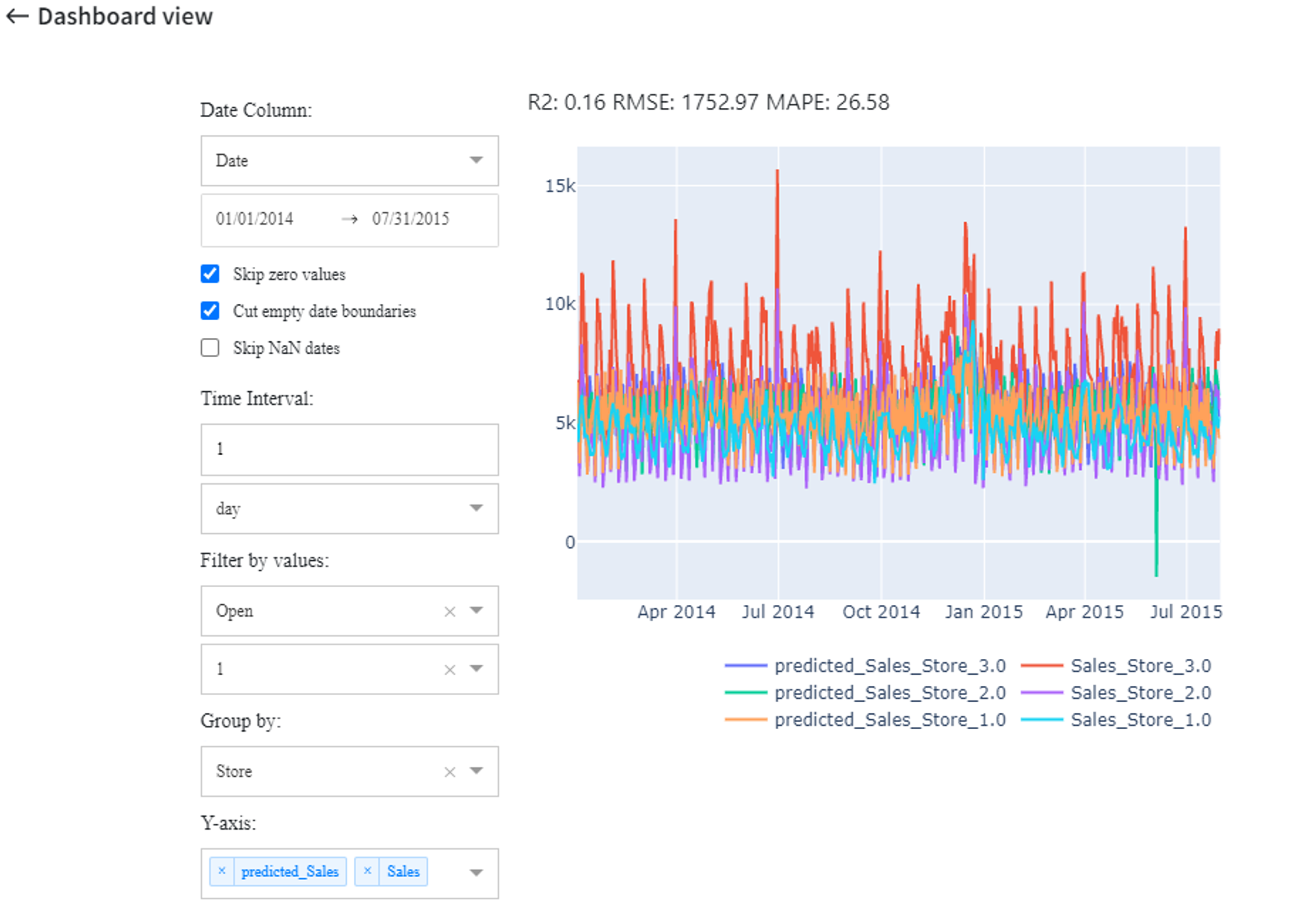
- Y-axis
And finally, the ‘Y-axis’ indicates the columns, whose values are visualized on the y-axis. Multiple columns can be selected.
We can view the ‘Sales’ for each store when the stores were open with the next settings: