General Information
K-means clustering is one of the simplest and popular unsupervised machine learning algorithms.
The objective of K-means brick is to group similar data points together and discover underlying patterns. To achieve this objective, K-means looks for a fixed number (k) of clusters in a dataset.
Description
Brick Location
Bricks → Analytics → Data Mining / AI → Clustering → K-Means Clustering
Brick Parameters
- Number of clusters
Amount of segments the data should be split into (k).
- Columns to exclude
List of columns that are going to be excluded from the analysis. These columns will be passed to the output dataset. It is possible to choose several columns by clicking on the '+' button in the brick settings.
- Remove all except selected
If the checkbox is on, only the selected columns will be considered, otherwise, they will be filtered out from the analysis.
Brick Inputs/Outputs
- Inputs
Brick takes the dataset.
- Outputs
Brick produces the dataset, with the additional column "predicted_cluster".
Example of usage
Let's consider the dataset from the binary classification problem . The general information about the dataset is represented below:
- passengerid (category) - ID of passenger
- name (category) - Passenger's name
- pclass (category) - Ticket class
- sex (category) - Gender
- age (numeric) - Age in years
- sibsp (numeric) - Number of siblings / spouses aboard the Titanic
- parch (category) - Number of parents / children aboard the Titanic
- ticket (category) - Ticket number
- fare (numeric) - Passenger fare
- cabin (category) - Cabin number
- embarked (category) - Port of Embarkation
- survived (boolean) - True/False
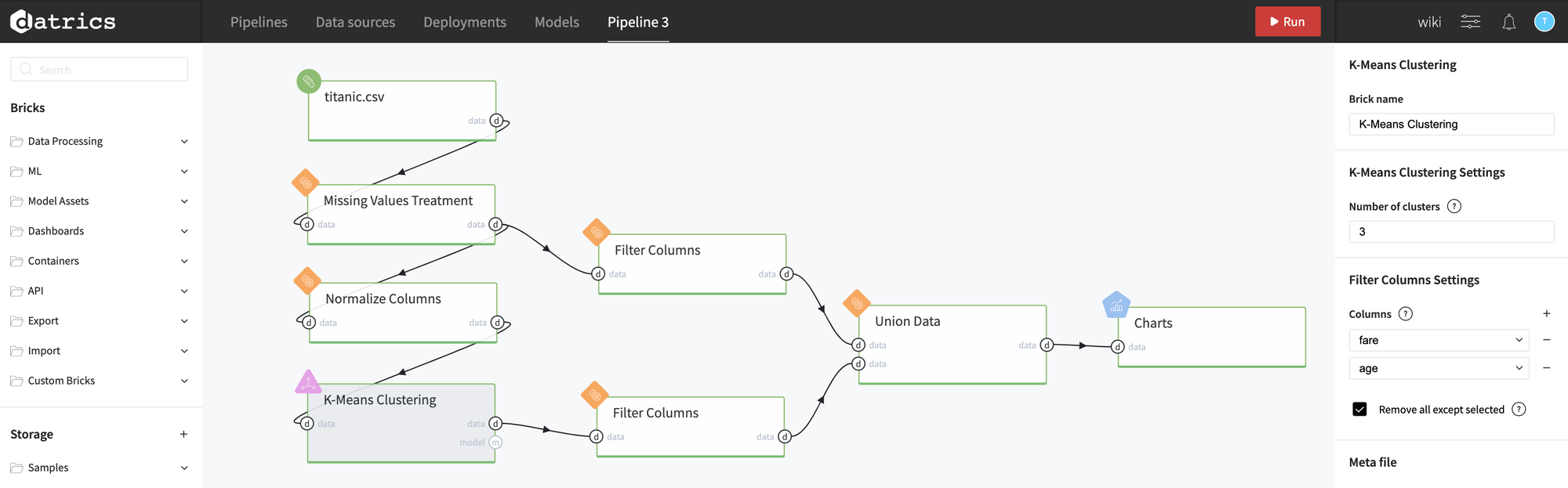
Let's split data into 3 clusters considering the following normalized features: Fare and Age. To use the algorithm we need to specify the number of clusters (k=3), and select only those columns in the Filter Columns Settings:
We can use Charts Brick to visualize result using a Scatter Plot (colors represent different clusters):
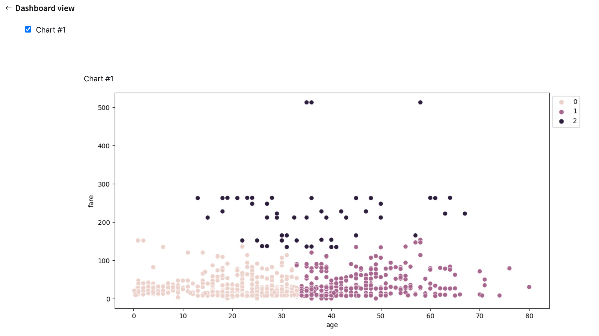
As we can see, the first two clusters combine the passengers with the fare less than 200 - all of them are divided into two groups - younger 35 years and older 35 years correspondingly. As for the third cluster, it definitely combines the passengers with high fare.